Colour
The colours you use for a product can influence whether your target audience is reached or changed and allows the viewer to understand what type of product it is. For example, a photography magazine using light, pastel colours on a magazine suggests that it is a lighthearted magazine with colourful images.
‘a gray-on-white design may look chic to younger eyes, but older users with fading eyesight may struggle to read.’
Trina Moitra1
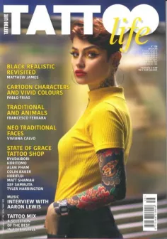
Good Example:

The colours used in the magazine are vibrant enough to catch the viewer’s eye but is not too saturated that it makes it hard for the viewer to read them, the use of warm tones also creates the idea of a friendly and inviting product.
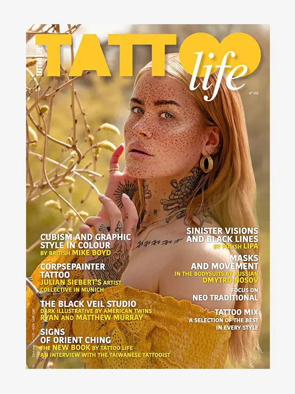
The text colour compliments the primary image, as well as creating a focal point on anything that is red – such as the tattoos and lipstick. Having the background blurred allows the viewers eyes to have a form of negative space that allows their eyes to rest whilst also framing the main focal point.
The background and the text in the foreground gives the idea that it is moving across the magazine cover horizontally whilst the mid-ground is vertical, this allowed the magazine to have effective layering and overall gives the impression that the magazine is professional.
You can also see in their other magazines how they adjust the colour scheme to compliment the primary image. They changed which text has colours and changed the layout of where the text is, this keeps frequent buyers of the magazine interested in the product as it changes with each issue but still stays aesthetically pleasing.
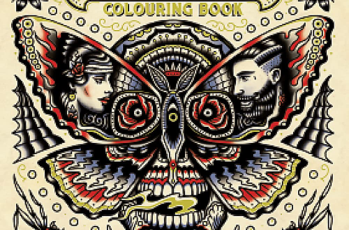
Bad Example:
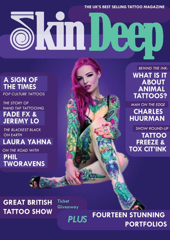
The colours are too oversaturated and aggressive in the way it stands out to the viewer. The harshness of the red on the logo put with the vibrancy of the purple makes the logo/header stand out in a negative way as it does not blend together, making the cover seem unbalanced and unprofessional.
The negative space in the magazine cover – whilst it is utilized – is not effective as it is too vibrant and busy that it does not allow the viewers eyes to rest. Similarly the logo may put viewers off of looking at the product as it is not very clear as to what the logo is meant to represent.
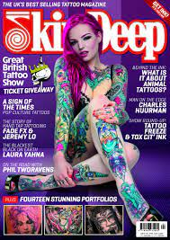
To improve the magazine I adjusted the colour scheme by making some of the colours less saturated and used . This made the magazine less harsh visually but still targeted the intended audience.
Similarly, the colours I used were analogous to each other as it meant the colours would compliment each other whilst looking more visually appealing. I took the colour that was displayed the most from the main image and used it within some of the text so the typography and images become more cohesive.
- Trina Moitra (2019)The Realist’s Guide to Using Color Psychology in Marketing, 10 January, Available online https://www.convert.com/blog/growth-marketing/using-color-psychology-marketing/#:~:text=Most%20colors%20are%20associated%20with,blue%20is%20calming%20and%20trustworthy. [Accessed 2/11/2023] ↩︎
- Tattoo Life (n.d.), Available online: https://www.americanmagazines.co.uk/tattoo-life-magazine-subscription.html# [Accessed 26/10/2023] ↩︎
- Tattoo Life (2021), Available online: https://www.tattooebooks.com/tattoo-ebook/tattoo-life-magazine-132 [Accessed 26/10/2023] ↩︎
- Skin Deep (n.d.), Available online: https://www.skindeep.co.uk/issue-261 ,[Accessed 26/10/23] ↩︎