Conceptual Design

A conceptual design – or a visual metaphor- allows designers to create innovative ideas that will capture an audience.
“A visual metaphor is a device for encouraging insights, a tool to think with…It is the task of the viewer to use the image for insight”
Noël Carroll2
When creating a conceptual design for a product, you must ensure that it is done correctly as people may not recognize or understand what the design is / what it means.
As I am looking at the theme of tattoos, I wanted to look at how other creative style books include conceptual design in their covers.
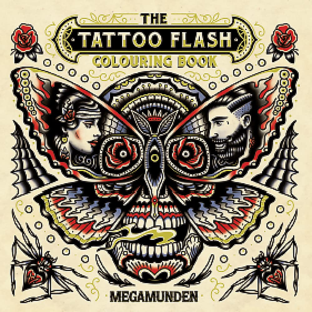
Good Example
The book cover has multiple images within the cover which suggests the style of art and what images are within the book. There are; 2 spiders, 2 people, a skeletons face with roses, a pen/ tattoo needle and a moth that can be seen within the book cover design. Each of these images gives the viewer an idea of will be inside the book.
The reason this book is conceptual is because it makes the viewers brain think more about the hidden details and allows the viewers eyes to take in the full image.
The colours used for the art cover are concordant throughout the book cover, meaning that the house style is consistent and allows the book to be more visually appealing to the viewer. The colours and art style suggest that the pages inside are about classic Americana style tattoos.
The composition of the book cover is visually appealing to the viewer as it is balanced as well as symmetrical. The negative space is spread evenly across the title book cover, allowing the conceptual images to be the focal point.
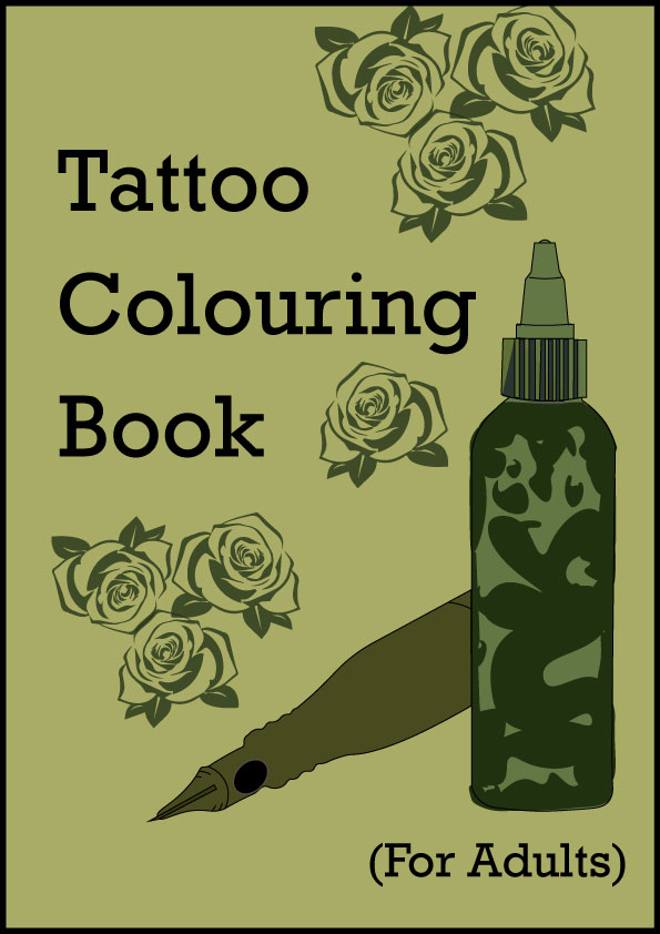
Bad Example
This book cover is not conceptual as it does not have any hidden meanings, symbols or messages on the cover and it does not encourage the viewer to look at something in a different way . The art style does not target the correct age group as the sub-heading states that it is a ‘colouring book for adults’, but the cartoon style art with simple shapes put with primary colours suggests a younger audience on the cover and the art on the cover does not actually reciprocate the art inside the book.
Another issue with the book cover is that the art itself is out of proportion – such as the sword not being straight, the roses etc. The cover is not aesthetically pleasing as the banner has one corner longer than another one which made the birds look uneven, the roses on the corners are not all visible and some are cut off and the sword is not straight.
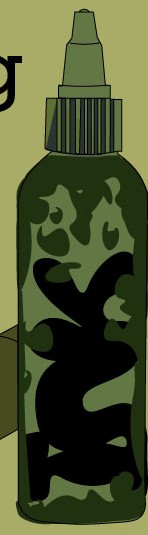
To make the book cover more conceptual I created a bottle filled with ink and hid the word ‘INK’ inside it. I added a cordless tattoo pen next to the bottle to influence the viewer into associating the conceptual art with tattoos. I added roses to ensure that the product still had elements from the original cover but made theme suit the art style inside the book. For the colour of the book I looked at different colours that appear in different type of colour tattoos and the shades of green worked well with the book cover the original colour I selected was too dark so I adjusted the lightness so it made the pictures and text more visible.
- Megamunden ,2017, The Tattoo flash colouring book, – https://www.amazon.co.uk/Tattoo-Flash-Colouring-Book-Books/dp/1780679165/ref=asc_df_1780679165/?tag=googshopuk-21&linkCode=df0&hvadid=310842836591&hvpos=&hvnetw=g&hvrand=6827682428901774758&hvpone=&hvptwo=&hvqmt=&hvdev=c&hvdvcmdl=&hvlocint=&hvlocphy=9046256&hvtargid=pla-421466972826&psc=1&th=1&psc=1 [Accessed 4/11/2023 ] ↩︎
- Noël Carroll, “Visual Metaphor,” in Beyond Aesthetics. Cambridge University Press, 2001, https://www.thoughtco.com/visual-metaphor-1692595 [Accessed 4/11/2023] ↩︎
- Tattoo – Colouring book for adults, https://www.amazon.co.uk/Tattoo-Coloring-Book-Adults-Relaxation/dp/B0CHVZLB37/ref=asc_df_B0CHVZLB37/?tag=googshopuk-21&linkCode=df0&hvadid=658883960063&hvpos=&hvnetw=g&hvrand=6827682428901774758&hvpone=&hvptwo=&hvqmt=&hvdev=c&hvdvcmdl=&hvlocint=&hvlocphy=9046256&hvtargid=pla-2205851744366&psc=1&th=1&psc=1 [Accessed 4/11/2023 ] ↩︎