Typography
Good Example

Typography is one of the most important things to consider when designing and creating a product as it is seen everywhere, for example it can be soon on logos, books, outside shops and even on tattoos. The fonts, colours, images and layouts you use all contribute to ensuring effective audience engagement and participation.
Typography is a subtle yet pivotal design discipline that can make or break your design. And creative use of fonts, beyond our wildest serif or sans serif dreams, can be powerful.
Desiree Cunningham2
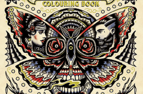
Looking at the theme of tattoos, a good example of typography is the book ‘Japanese Tattoos’, this is because it uses de-saturated, neutral tones for the background and text to focus your attention on the red colours on the tattoo, creating the primary focal point for the front of the book. The negative space between the text and images frames the primary focal point as well as providing an area for people’s eyes to rest.
The font used for the book is simple and effective; the text does not take away from the main subject-as it is the second thing your eyes go to – but it still stands out when needed. The face of the tattoo looks over the text which cuts out some of the letter, this allows the text and images to be more cohesive. Using the sans font for the main title presents the book as easy to read and does not use convoluted words, whereas the use of the sans-serif font for the authors name presents the idea that the author is experienced in what they are talking about.
Bad Example
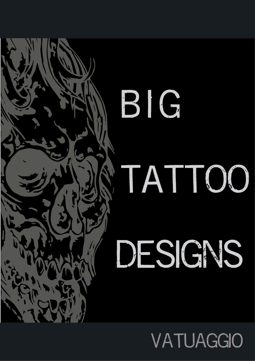
A bad example of typography is the Big tattoo designs book. There are too many different font styles, making the book seem less professional and is eye-catching in a negative way as you look at the cover and, as none of it is cohesive or has anything to tie it together, it doesn’t draw the audience in.

The book cover does not work well as it doesn’t look balanced, the text ’Big’ slightly overlaps the image and the font used is loud and bold and gives the text a more 3-dimensional look. For the style of font used, it looks like it would work better for graffiti / street style art or fashion.
The text ’tattoo’ has a kind of glitchy red effect which slightly overlaps the image. The placement of the text does not look like it is central, this is because the variety of fonts and the sizes used impacted how balanced and visually appealing the book cover looks.
The font used for the text ’designs’ does not fit the style of book the other fonts are portraying as it looks more elegant and upbeat compared to the dark, grungy aesthetic seen by the images and colours used. All the fonts look like they could be used for much younger audiences than what targeted age group they are trying to attract.
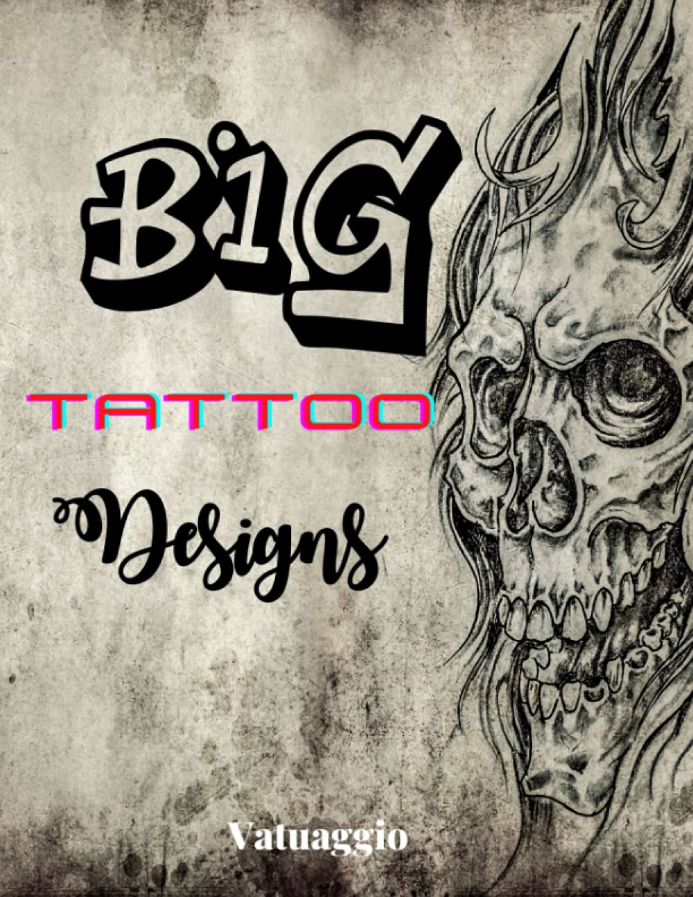
To improve the book cover, I changed the colours and fonts to a more modern art style and incorporated the same tattoo from the original book cover to keep the theme of the book the same. I changed the typography so it is more sophisticated and professional, allowing the correct age group to be targeted.
- Yori Moriarty, 2018, Japanese Tattoos, https://www.amazon.co.uk/Irezumi-Itai-Traditional-Japanese-Meanings/dp/8416851964#detailBullets_feature_div ,[05/10/23] ↩︎
- Desiree Cunningham (n.d.)Typography: Web Design’s Best Kept Secret, n.d. , Available online https://skillcrush.com/blog/typography-guide/#:~:text=Typography%20is%20often%20overlooked%20in,serif%20dreams%2C%20can%20be%20powerful. [Accessed 4/11/2023] ↩︎
- Vatuaggio, 2021, Big Tattoo Designs, https://www.amazon.co.uk/Big-Tattoo-Designs-Illustrations-Drawings/dp/B0979P7B4W ,[05/10/23] ↩︎