Typographical Graphic Standards
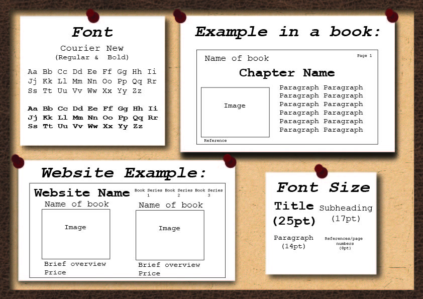
Font
Accessibility should be a key influence for when you are designing a product. If it is not accessible for the audience then the product will not be as successful compared to other products.
To ensure the font is accessible to as many people as possible I had a look at fonts that are the most helpful for people with reading limitations- such as dyslexia.
Looking at a survey, it showed that ‘good fonts for people with dyslexia are Helvetica, Courier, Arial, Verdana and CMU, taking into consideration both, reading performance and subjective preferences’ (Rello and Baeza-Yates, 2013). After looking at the fonts I decided that Courier New was the best option, this is because it is a serif font which makes the characters is easy to read and tell apart from other characters whether it is in bold, italic or just regular text.
Logo’s
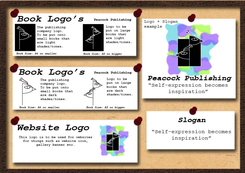
For the logos layouts, I wanted designs that could be interchangeable for each product, as I was designing the logo for the publishing company I decided that there should be different icons depending on the size and media of the product produced.
Large products – such as A3 books- will have a detailed version of the simple logo, this is so it stands out more on larger products and utilises the space available, whereas products that are A4 will have a smaller /condensed logo so all the detail can be seen and will not blur together as the logo is not overcrowded.
For websites, I decided to use a colourful logo with the large icon design so it would be memorable and eye catching. Because the logo used for the large products incorporates the design from the smaller logos, it means that any of the logos could be easily identified and associated with the company.
Colours
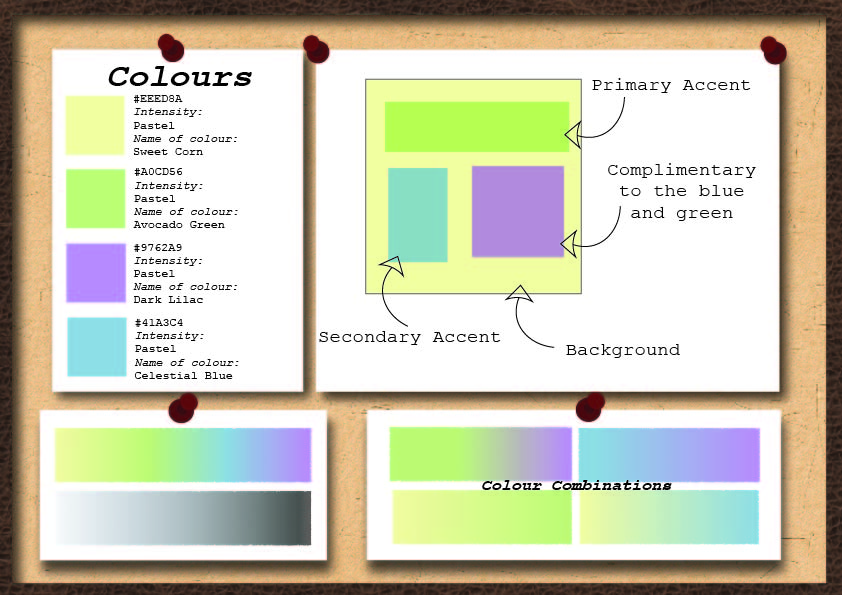
The brand’s colors predominantly feature pastel tones. These hues enable clear visibility of both black and white text when placed on them, ensuring that the design is clear and easy to read. The colours chosen – whilst chosen for visual appearance- can subconsciously portray different ideas.
‘Consumers attach feelings they have about certain colors (e.g., black as luxurious) to the product. In turn, those color associations influence their perception of your brand.’
(Maybray, 2022)
Similarly, to ensure that the colours were accessible to those who are colour blind, the colours were put in a color blind filters and it showed that these pastel colors remain distinct and visible under different conditions.
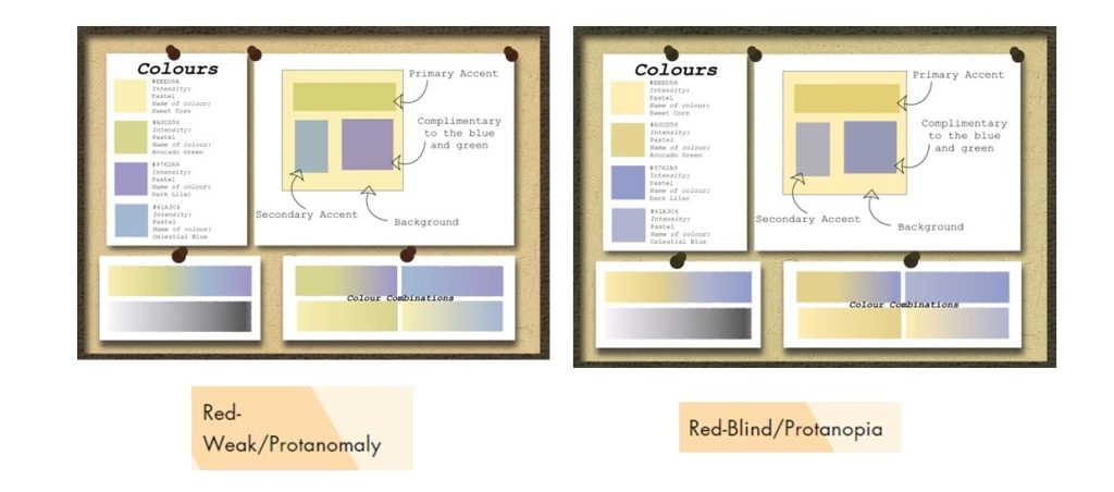
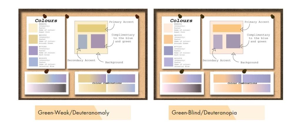
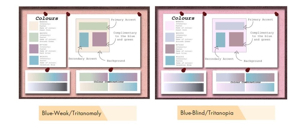
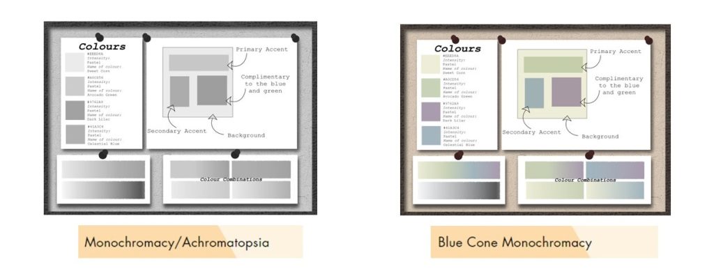
Filters such as red, green and blue- Weak / protanomaly, blue- blind/tritanopia and blue cone monochromacy does not seem to have a huge affect on the colours being together and can easily be identified as different colours however, all filters have colour gradients that can not be identified easily which would mean that colour gradients shouldn’t always be used as it wont be accessible to everyone.
Rello, L. and Baeza-Yates, R. (2013). Good Fonts for Dyslexia. [online] Available at: https://dyslexiahelp.umich.edu/sites/default/files/good_fonts_for_dyslexia_study.pdf [Accessed 28/12/23]
Maybray, B. (2022). Color Psychology: How To Use it in Marketing and Branding. [online] blog.hubspot.com. Available at: https://blog.hubspot.com/the-hustle/psychology-of-color.[Accessed 06/01/2024]