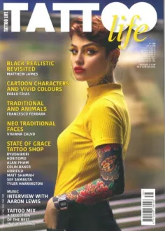
Editorial Information Pages
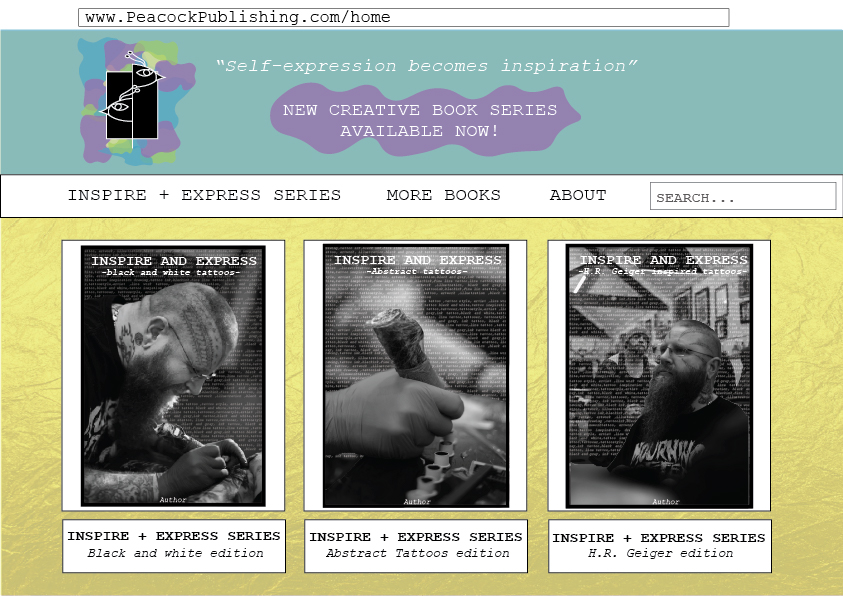
The first layout that I started with was the Peacock publishing website. I kept the design vibrant and colourful to reflect the ideas behind the logo and the books that they publish /sell. The main yellow background has a paper like texture to reflect the idea of creating or writing a piece of art.
The layout is simple and easy to follow with the main navigation system on a separate section that is a white bar, so it stands out between the top section of the web page as well as the bottom section.
As Peacock publishing is the company who is making the ‘inspire and express’ books, there is a section on the navigation bar that will take you to a page about the series, this not only allows for a quick access to the collection, but also publicises the series to those who may not have seen it advertised.
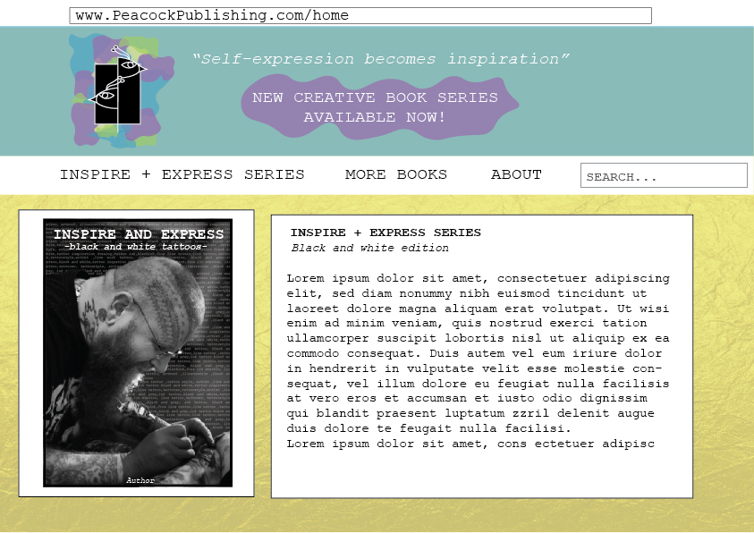
When you click on one of the books on the website you’ll be taken to a new page, this page will display the front cover of the book the title and addition you have clicked on as well as information as to what is inside the book.
As Peacock publishing are the creators and publishers of the book there is a layout design spread to ensure all books within the series follow a similar house style. First page displays the front cover and the back cover this is there to show how the text should be displayed, specifically for the blurb.
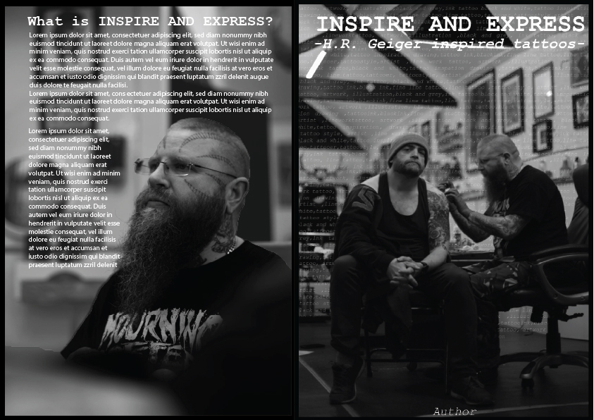
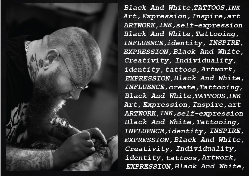
The next layout page is for the title page (or the first page you see when you first open the book), it should have an image on the left side and text associated with the genre of the book on the other side, this is there so the viewer can see if the theme they are looking for is covered within the book by looking at the key words.
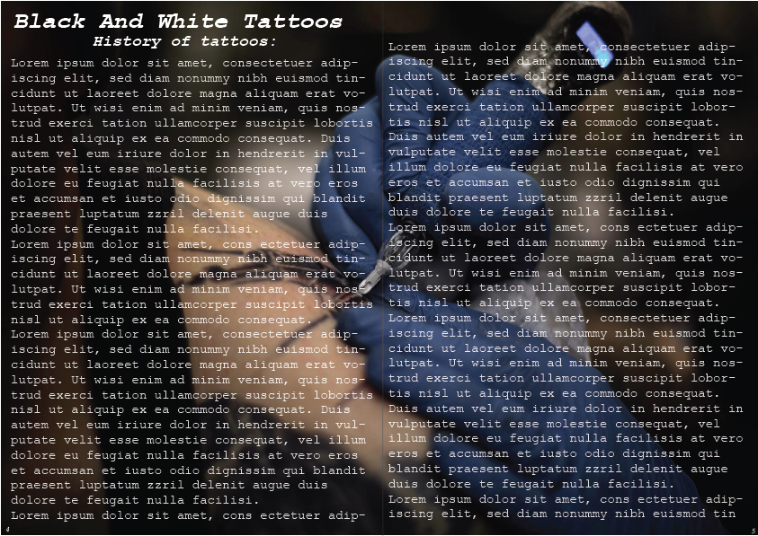
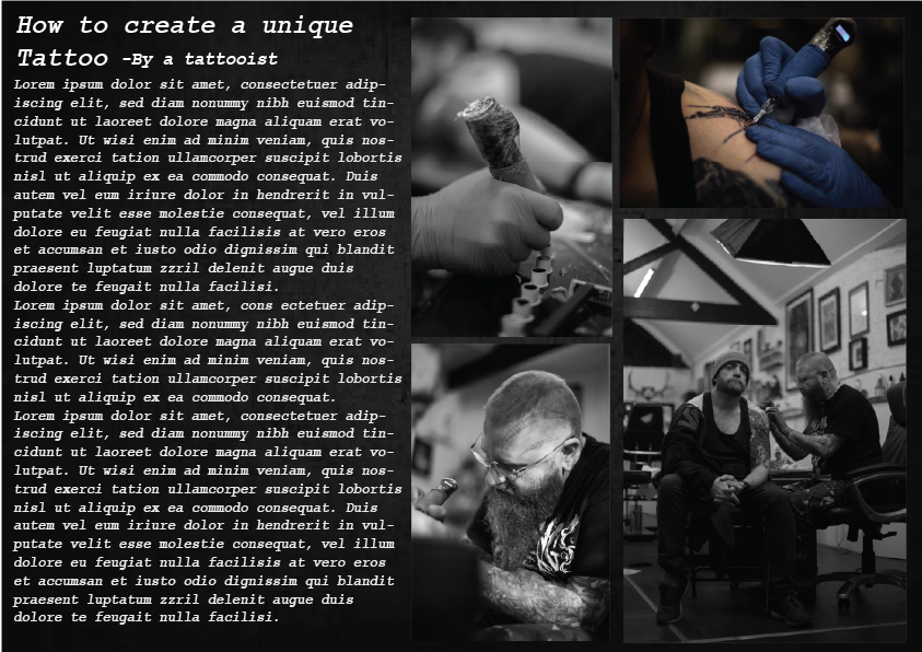
As art is a visual subject, each page should have some form of imagery. Next layout page has an example of how you would display one of the chapters -in case the history of tattoos. This displays how the title and subheading should placed for large written chapters. Whereas the text layout page shows how a page should be set out if the chapter has a lower word count.
The reason the background pages have texture or an image behind it is so that it keeps the viewer visually engaged with the book and doesn’t make the viewer feel like they’re reading pages upon pages of words without giving the viewer’s eyes chance to rest.
Overall these pages make it clear for anyone to understand how the layout should be, whether it’s for the websites design or for the books layout.