Design Research Blog
Festival Idea
Defining the UX
About the festival, Problem Space
The fire festival is a week long event that occurs at the beginning of each spring, summer, autumn and winter season in Embo, Scotland. The event features a variety of performances, from fire performances displayed by highly skilled professionals to music performed by top bands. The reason that the festival will be in a small village is because it can increase the attraction to the destination (Quora, n.d.) as well as the fact that it wont be in a busy area so anyone travelling via a car will not have to deal with as much traffic.
Some things to consider when arranging the festival is the council permissions, location of the event, vendors and performers, transport and basic user requirements.
As the location of the event is in a small rural village, the best place to hold the event is on a field, this prevents any concerns for the lack of parking in the town centre and also allows for distance between the village and the event (preventing any upset residents). To use the field, permission will have to be given by the farmer who owns it and will be compensated by being paid to use the land, similarly the council will be contacted first to ensure the event can take place. /For transport, there will be busses that will take people from Dornoch to Embo village, these buses will be from the sponsor, big green coach. Similarly for accommodation, there is an option to camp on site at the event as well as having hotels / B&B’s in the area, the festival also needs to consider the performers and vendors that will be attending the festival and ensure that they are available for the days it is running.
The app will have an interactive map that has the location where all the events are taking place as well as the location of market stalls and areas to get food. The app will also gives the users the option to share their live location with other users, this feature would be handy for staff and performers who need to find each other and the interactivity of the map would make it easy for users to navigate.
Some people will also need to use the bus services, to ensure that people can travel to and from events, the map will have bus stops highlighted and both app and website will have a transport section; this will have any information regarding transport i.e. bus timings, cancelled buses ,taxi companies you can call etc.
On the other hand, the website will have more information about the festival, such as how to contact customer support, how to report issues etc. This is because it will allow users to prepare themselves for the festival before buying a ticket. The website will also have a map but it will only be a simple map as a portable device will be needed for an interactive map this is because the interactive map will use your location to tell you how to get to a specific location at the event.
Requirements Gathering and Analysis
Audience, Stakeholders, Product Users, Similar websites, Accessibility concerns, User Journey Maps, Personas, Success, Assumptions
The festival is for anyone, however the primary audience for the festival is people who are 20-35-year-olds with the secondary audience being 35-45 years old. People who attend the festival may have an interest in unique performances and social events, similarly people who are pagan, wiccan or believe in mother nature may enjoy the festival as it falls on events in their calendar, i.e beltane occurs at the beginning of summer.
For people with families, it may be an event that parents would like to go to, however they may not be able to arrange for their child to be looked after. To ensure that people do not have to miss out, there will be child friendly days during the first 2/3 nights of the festival- with appropriate performances and services available for the young people.
The stake holders for this event are any sponsors of the festival such as local sponsors and big companies like coke, and red bull are most likely to sponsor festivals (Marketing Brew, n.d.) , sellers/vendors as well as hotels/ B&B’s are also stake holders in the event as it is a good opportunity to network and sell their products to customers. The council are also stakeholders in the event as they authorise the event to go forward, if the event doesn’t do well or there is a negative impact and the festival is the cause of it then the council will not let it run again. For the stakeholders, a successful event would be the festival gaining a big following both online and in attendance as well as a decent profit after the event has been ran.
The basic user requirements for user needs are:
- Areas for food and drink
- Hygiene areas i.e toilets, showers
- Bins for litter
- Suitable sleeping area for tents to be put up
- Maps
- Guides
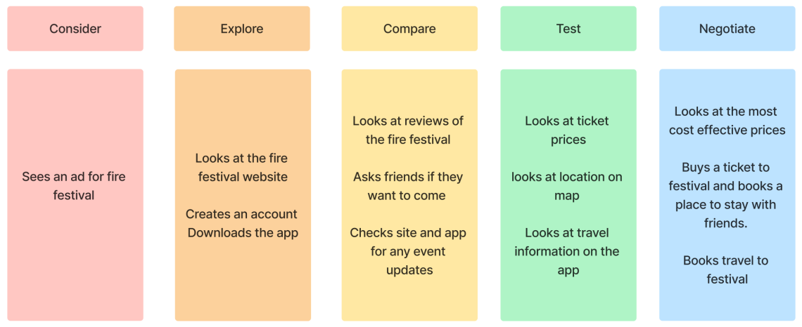
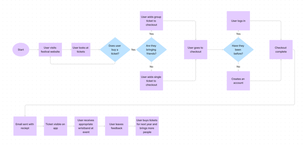
The main things the users need for the app and website is a section to view and buy tickets, an interactive map, events timetable as well as a section that tells you about the festival with contact information and FAQ’s. These sections will be prioritised when making the app/ website as anyone wanting to find out more information about the festival will most likely require one of the sections mentioned prior.
The food and drink sections will be varied across the whole of the festival site to ensure everyone has access to food and drink when they need it- the same will be done for the bins. Looking at other similar festivals, one of the complaints was that the toilets had to be payed for
I found it worth the walk… except for the toilets, which are currently charging a whopping £1 for a pee.
Tripadvisor (2022)
This resulted in lower user satisfaction, to prevent this, toilets and showers will be accessible to everyone and will not require anyone to pay for their services and will be mentioned in the ‘about’ section of the festival
A festival that has a similar concept to the fire festival, is the Beltane fire festival.
The first thing you see when you look at their website is the logo and festival name front and centre of the website with a banner underneath it with different header options. The website has a variety of sections to go to, however it is not clearly labelled on how to get tickets, and at first glance it looks as if there is no options to buy a ticket. Apart from that, the house style is consistent and fits the theme of the festival and is also intuitive for the user to know how to navigate the website, the layout of the website allows for users to intuitively navigate their way around it.
A festival that used an app alongside their website is Coachella. The main use for the Coachella app is to view the line-ups as well as a way for users to set up their wristband.
The visual design of the app is aesthetically pleasing and has a consistant house style between the app and website.
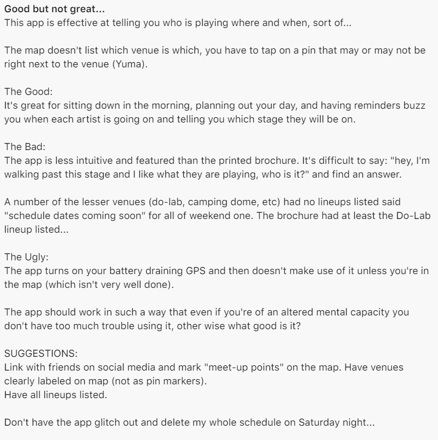
After looking at the reviews, it was clear that the apps notification feature was appreciated by a wide variety of users alongside the feature to select which performances/ events they would like to attend and create their own event plan.
Some users have had issues with the map and cannot see the name of the stage/ name of the event location as it is hidden by a location pin marker – with some users unable to see it at all on other app platforms and in one of the reviews they said that ‘the app is less intuitive and featured than the brochure’ this would be an issue as it could lead to people not using the app which may mean people will not see key information.
Learning from the customer feedback, the festival application will have a map that has clear labeling with little to no location pin markers as well as having sections with information about the festival, for example:
- What the festival is about
- What people can/ can’t bring to the festival
- Contact information
- Tickets
- FAQ’s
Some accessibility concerns for the physical event may be those who do not have access to their phone because it has ran out of battery or people do not have enough storage to access the app, to fix this issue there will be physical maps available for people to take around as well as a large poster size map placed around the festival location in case people lose their map.
For accessibility for the app and website, to ensure that it is intuitive and can be used by everyone, the following will have to be considered when designing the app and website:
- Colour blindness
- Language
- Dyslexia and other learning disabilities
- People who are visually impaired
Other accessibility issues that need to be considered is the colours used i.e. if the colours are too saturated and are contrasting against each other then it will make it hard to see what is being displayed on the website/ app. Similarly the apps features needs to be compatible with Android and IOS devices and have a similar display to ensure that all of the products created are cohesive.
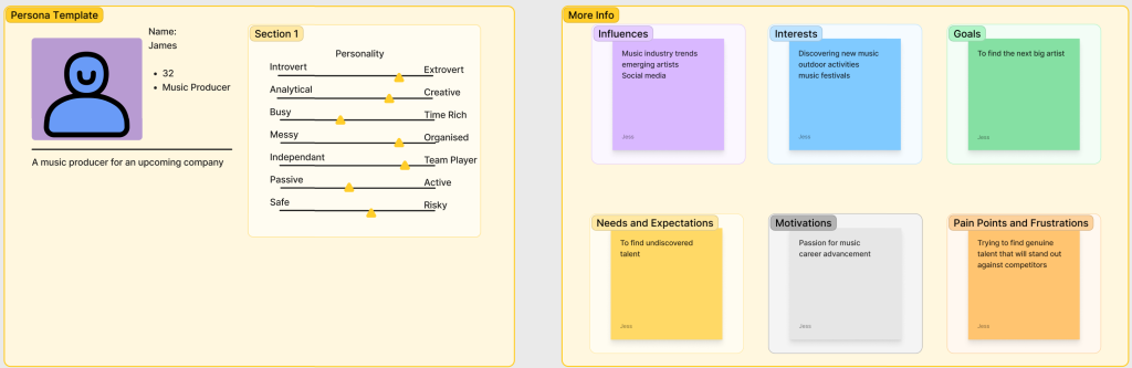
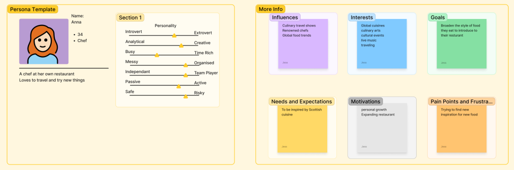
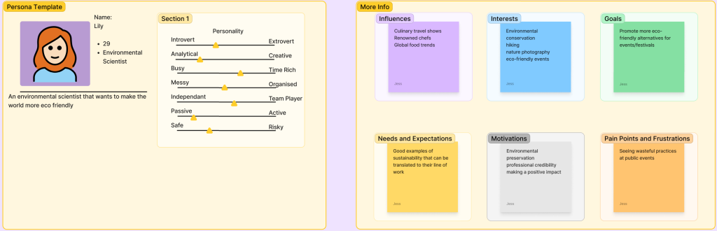
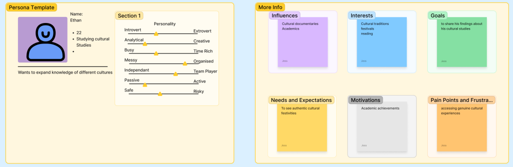
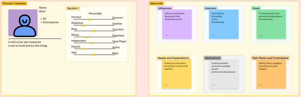
Creating a user journey map allows an understanding as to how a user will think to navigate/ use a website or app, creating this with personas allowed a better understanding of what the target audience will require in the app/website. Each persona was created with a different career to ensure that the research was as varied as possible.
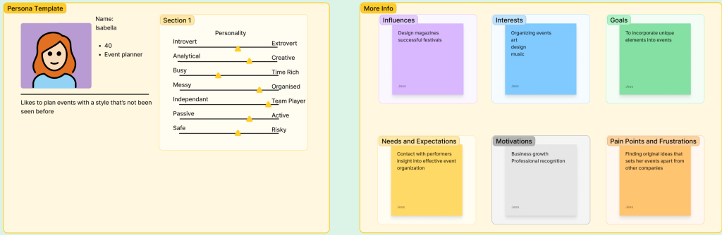
A successful design will ensure that everyone can intuitively navigate their way around the app/ website, the design of the website/ app will be visually appealing to ensure that it comes across both professional and appealing.
Assumptions for the festival may be that the performers will be able to arrive on time to their allocated festival location for their next performance, to ensure that performers have enough time to travel and set up after each performance a timetable will be made to include the time it takes to walk from each location, similarly performers will also be encouraged to have the app so they can use the interactive map to take the most effective route.
UI Principles
Design Laws, Usability goals, Call to action, Interface
Looking at the different laws of design, one of the key laws that will be heavily considered when creating the app/ website is the aesthetic usability effect.
This law talks about how having a visually appealing design will increase a positive response in peoples brains (Yablonski, 2022). Taking this into consideration, when the app/ website is being designed the house style and display will be treated as the focal point of the product, rather than the advertising of the festival.
To increase a users interactivity with the app/ website, there will be call to actions added to the design. A call to action will typically have some form of text such as ‘Click here’ or ‘Shop Now’ to encourage users to click around the site. ‘Buy tickets now’ will be the festival sites main call to action alongside other phrases such as ‘Find out more here’ and ‘Subscribe for updates’. Similarly, to highlight key call to actions, when a user hovers their mouse over a specific button/ icon it will slightly change to show that it can be interacted with.
The interface for the stakeholders will be the same as the one for regular users, this is because the app and website will be designed for regular users which means that any important information can be seen by everyone. Having the app designed for regular users means that anyone requiring other information will have to contact/ be contacted by an event organizer, this ensures that people can not break into someones account and access information about the event.
Rejected Designs
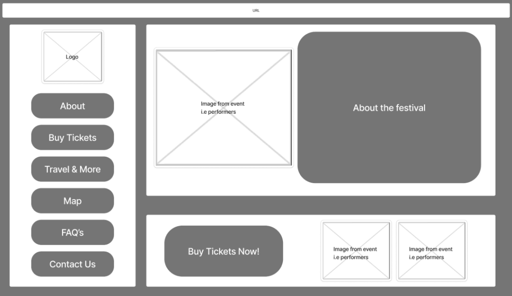
The reason this design was rejected was because even though everything that is important can be accessed, the design isn’t memorable as it is simple.
If the website was created for an educational product then it would be suitable, however, because the website is for spreading information about an event that is there for entertainment, the website should replicate the atmosphere at the event and be dynamic and engaging with the user.
Similarly, the layout of the site is too busy for the space allocated, for example , the left side of the menu could be condensed into a ‘burger menu’, this would allow the website to have more space, making a key focal point easier to be found by the user.
Having a simple layout doesn’t cater towards the primary audience as the simple shapes and the lack of interactivity makes it looks as though it is designed for a younger audience.
Low Fidelity UI Prototype
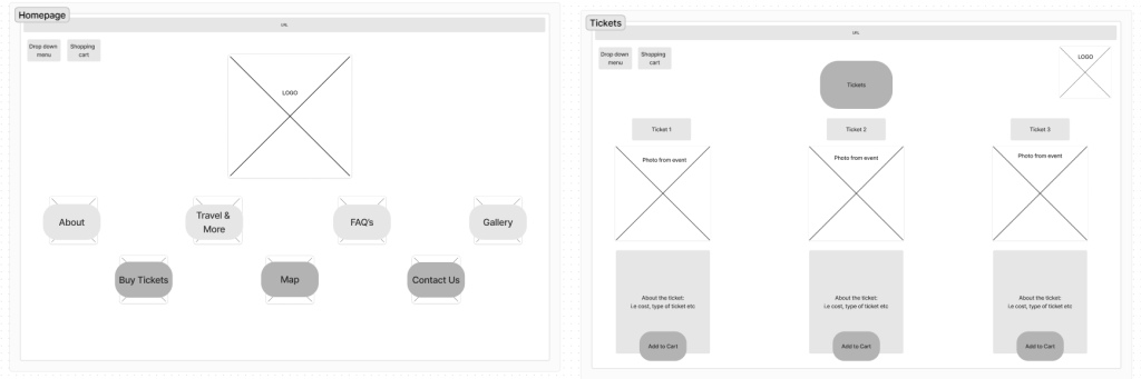
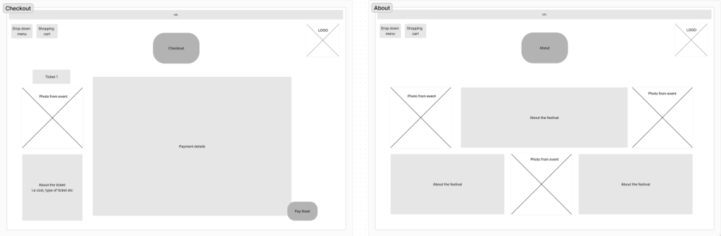
As this is a low-fidelity design, the house style -font, colours etc- will be looked at more in depth during the creating of the site.
For the website, the homepage should replicate how vibrant the fire festival is, to do this the design needs to be dynamic and memorable. To stand out from other websites, the layout for the website was made to be more free-form unlike other sites that have a fixed layout i.e all images on the left, text on the right with a banner across the top with the logo.
For the homepage, each category option will be interactive. The section options -such as tickets- will be a fire torch and when a users hovers their mouse over the text/ object the fire becomes a bigger flame to highlight to the user which category they are selecting.
For the tickets section – similar to the homepage- when you hover over the ‘add to cart’ button, it will change slightly by increasing in size and slightly changing colour to make it clear which option has been selected. The layout of the tickets have the ticket types in columns, this is to make it clear to the user which information is relating to each ticket and by having an image between the ticket and the information it allows the viewers to have a quick break from reading whilst also keeping them interested.
Quora. (n.d.). Why are most festivals organized in random smaller towns and not in big cities? [online] Available at: https://www.quora.com/Why-are-most-festivals-organized-in-random-smaller-towns-and-not-in-big-cities [Accessed 8 Mar. 2024].
Marketing Brew. (n.d.). Beverage brands dominate festival sponsorships: report. [online] Available at: https://www.marketingbrew.com/stories/2023/09/27/beverage-brands-dominate-festival-sponsorships-report.[Accessed 23/02/24]
Tripadvisor. (08/06/2022). Hilltop attraction – Calton Hill, Edinburgh Traveller Reviews. [online] Available at: https://www.tripadvisor.co.uk/ShowUserReviews-g186525-d190124-r867682776-Calton_Hill-Edinburgh_Scotland.html [Accessed 26 Feb. 2024].
PDX (2014). Available at: https://apps.apple.com/us/app/coachella-official/id632833729?see-all=reviews [Accessed 5 Mar. 2024].
Yablonski, J. (2022). Aesthetic-Usability Effect. [online] Laws of UX. Available at: https://lawsofux.com/aesthetic-usability-effect/.[Accessed 9 Mar. 2024]

