Website Design Development (Post 1)
The feedback on the first design of the website was that the design was overly simple with which had too much negative space as well as having a layout that is not familiar to users.
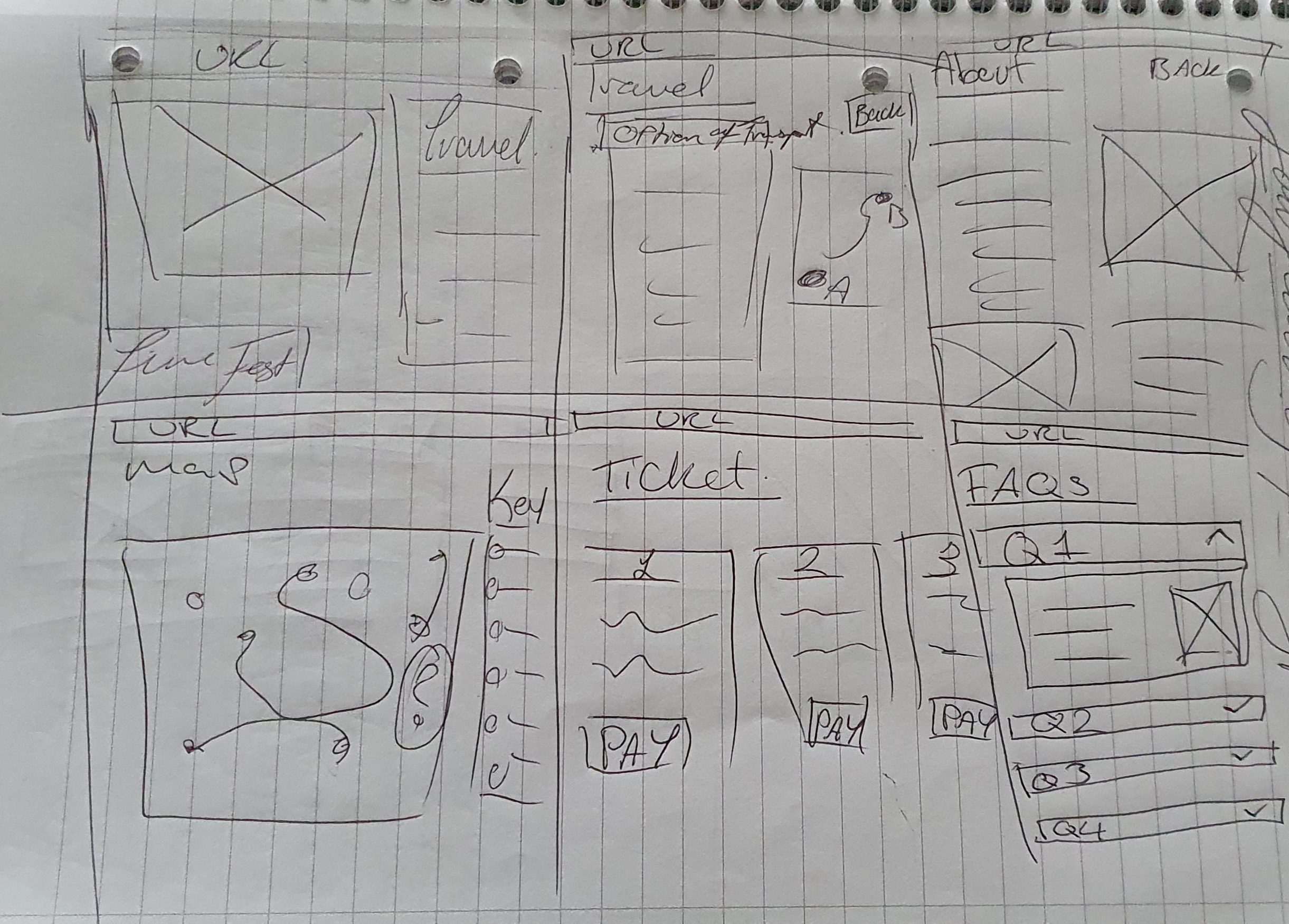
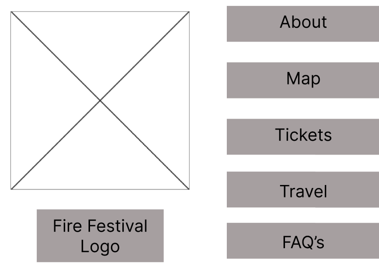
To develop the website with the feedback given, the placement of the navigation buttons / text have been moved to one side of the page to make the layout feel more familiar for users.
As this is a rough design for the website, it does not show the transitions or animations that the final design will have and instead, will only show how to navigate to different pages and where the images/ videos will go.
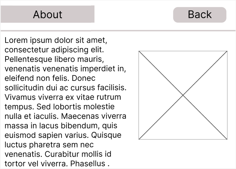
The first page that was created was the ‘about’ page, this was created first as users who will not have heard of the fire festival before will want to know more about it. To ensure that the information was easy to find, the ‘about’ and other sections are displayed on the page without any menus .The layout of the first ‘about’ page design was not visually appealing as it had the paragraphs and images too close together which made it harder for people to read and understand.
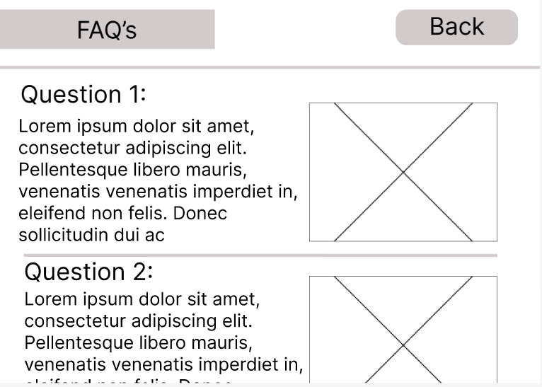
To improve the design, the layout was changed to a format that users will be more familiar with. Having the photo on the right side of the screen will become the main focal point when the page load, this is to utilise the fact that people process visual data better than any other type of data (ifvp.org, n.d.)and having the image there will give the viewers the general idea as to what is being spoken about in the text to the left. Majority of the other pages- such as -FAQ’s, map and travel – follow the same layout as the ‘about’ page to keep the layout consistent throughout the site.
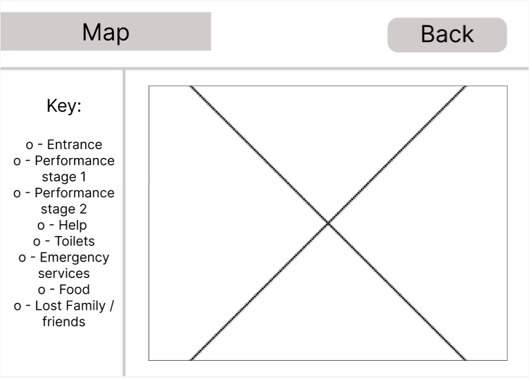
The ‘map’ page has a non-interactive map with a key on the left side to tell the viewers what each icon means, this map would be used as the physical maps people would use when they are at the festival and want a paper copy.
The map is non-interactive because when people are at the festival, they won’t have a desktop to carry with them and instead would be carrying a mobile device with the app downloaded as that will have an interactive map for them to use on site.
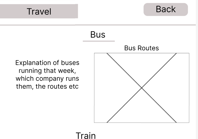
The travel and FAQ pages have a similar design, however,the questions within the FAQ page will have a drop down to see the response to each question, this makes it less overwhelming for the viewer as they wont have to look through a variety of text and it also keeps the web page visually appealing.
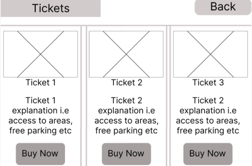
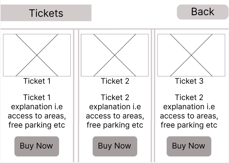
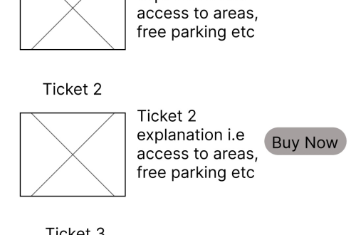
The ‘tickets’ page utilises 3 coloumns to display the ticket options on the page. this design allowed each ticket option to have a clear and definitive division between each option whilst also making the web page visually appealing.
ifvp.org. (n.d.). This is why our brain loves pictures | International Forum of Visual Practitioners. [online] Available at: https://ifvp.org/content/why-our-brain-loves-pictures#:~:text=In%20fact%2C%20the%20human%20brain. [Accessed 03/04/2024]


You May Also Like
App Design Development (Post 2)
Typography (Post 5)