User flow – UI wireframing
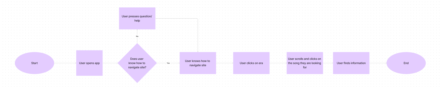
The first thing that was created before the wire frame for the app was the user flow diagram, this was so the design would incorporate key things the user needs when navigating the site.
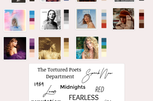
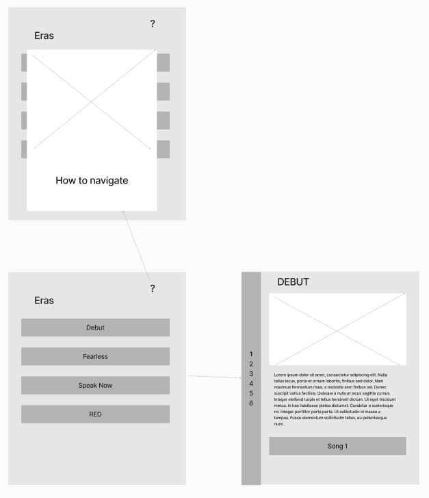
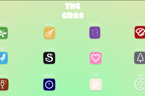
For the first wire frame, the design was made to make it easy for users to navigate, this was done by making a simple homepage with rows for the users to select the era they would like to look at – If a user does not understand how to navigate the site then they can click the question mark in the top right corner and it will display an overlay on how to navigate the site. When they click on an era, the page will load with an image at the top of the page with information about the album underneath, under the album information section, all the songs would be displayed with the meaning about it underneath.
Whilst the design is simple for users to follow, the homepage may be too simple for the age group that could be using the app, similarly it would not be visually engaging. Similarly, an overlay on top of the main page may be visually overwhelming for certain users and they may not know how to get the overlay off if they have not had it on the screen before. For the era page, users do not have a lot of interactivity except from scrolling up and down, the design is also very cramped and would take a user a while to find their song – especially if it has over 30 songs.
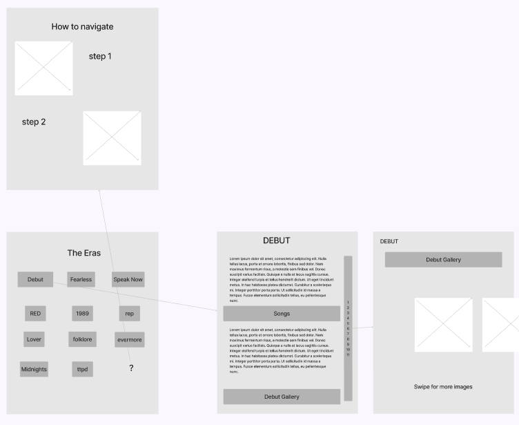
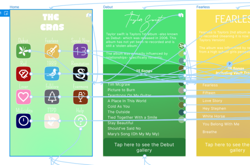
To improve on the design, the homepage has the eras displayed as if each one was an app on a phone, this makes the design familiar to the user which makes the interactivity more intuitive for the user. If a user does not understand how to navigate, they can click on the question mark and a different page will appear explaining how to use the app. When a user clicks onto an era, the page will load with the title of the album and information about it, beneath that information is the song titles that users can scroll through and click on the title of the song they want to know more about- when they click on a song a separate page will appear and have a brief description about it. The images have been moved to a separate page as well to make the app more visually appealing and less cluttered, when the ‘view [era]’s gallery’ is clicked, the page will load with a carousel of images for the users to swipe through.

You May Also Like
Adapting Your Design for Web Deployment
UI prototyping for Mobile Application