Current Website Design Approaches
The design of a website is important because it is the first thing viewers notice, and their initial impression of the organization will be based on this design.
RSPCA
Our mission is to make sure that all animals have a good life, by rescuing and caring for those in need, by speaking on behalf of all animals and by inspiring everyone to treat them with compassion and respect.
(RSPCA, nd)
The RSPCA website design has a vibrant homepage which is eyecatching for many, however for some people it could be too vibrant and be harsh on viewers eyes. However the site was made with this issue in mind and it has a toggle in the top right corner to change the colours from ‘Vibrant’ to ‘Calm’, when a user changes the toggle to ‘calm’ the colours and images are de-saturated – however this is not available across all of RSPCA’s site and could lower the amount of time users spend on the site.
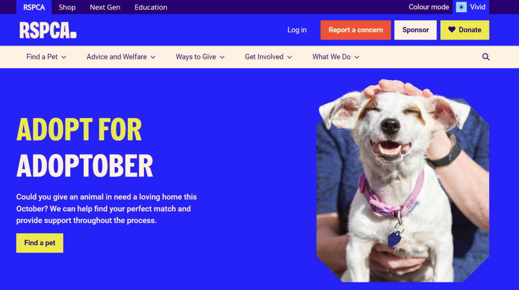
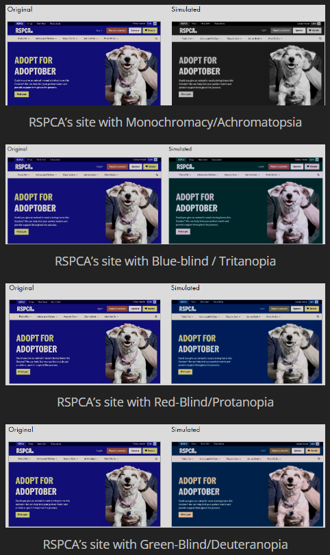
The colours that are used are visually appealing as they are both complimentary. Another feature that makes the site accessible is the contrast between the background colour and the colour of the typography on the site makes it accessible for colour blind users.
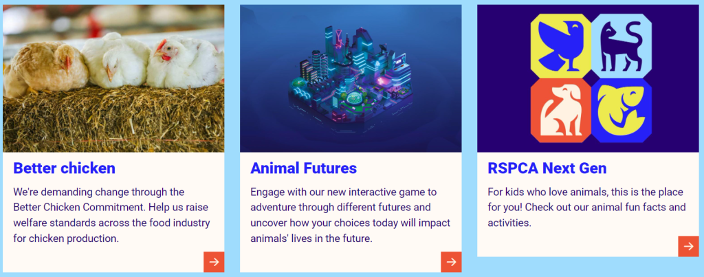
The site utilizes negative space and uses it to not only give viewers eyes a chance to rest, but it is also used to make it clear to viewers where a new section/ topic is beginning. The layout and navigation of the site is easy to use and can intuitively find how to get to another section. To contribute to the layout, the images used within the site have an interesting shape to them to make the layout eye catching
RSPCA’s site is usable across a variety of devices – i.e phones, tablets, laptops etc- as it has a responsive design layout and it will adjust to whatever size the viewer needs.
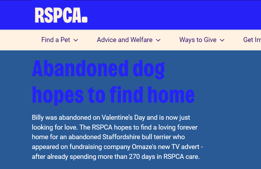
On the other hand if you go to other parts of the site, such as ”billy’, the typography at the top of the page is hard to read as there is little to no contrast between the text and the background which is also going to be hard for colour blind users to differentiate. Another design flaw that may make the site look less professional is the 3 boxes on the homepage are not the same length.
After looking at RSPCA’s site, you can clearly see that their mission statement is reflected in their web design. The site uses the same house style throughout all of their pages and follows a similar layout on all of its pages, making it visually appealing for its users.
For my own website design, I aim to incorporate features that enhance user experience, such as a color palette toggle and uniquely shaped images to create an engaging and accessible environment. These elements will not only attract visitors but also ensure that they feel welcomed and respected, much like the mission that drives the RSPCA forward. In conclusion, a well-designed website is fundamental in establishing an organization’s ethos and fostering a sense of community among its audience.
References:
www.rspca.org.uk. (n.d.). How we work | RSPCA. [online] Available at: https://www.rspca.org.uk/whatwedo/howwework. [Accessed 21/10/24]