Development Log
Initial Planning Phase + Feedback on Trinity Scout Site
The main goal is to increase interest in scouts so more people will join the group to become a leader or a scout. Recruitment will be focused equally on gaining leaders and scouts as the sections cannot run without a leader present and the group will close without enough young people attending.
The most effective way to do this is by utilizing social media platforms and uploading promotional material that has a hashtag linked to it which says #Explore,Discover,Grow. For this hashtag, the goal would be to have people share new experiences they have done for everyone to see and try. An example of this could be someone posting a picture of them rock climbing for the first time or someone sharing a good hiking location for others to use. The hashtag is simple and easy to remember and the goal of the hashtag is for it to become a trend and so people can become part of a community that is associated with scouts for those who do not have a scout group nearby. Similarly it will allow people and scouting groups to try new things and develop skills such as communication and teamwork as well as encouraging adventure.
The Trinity Scout website will be re-designed/ developed so it is visually engaging and encouraging new members to join. To ensure that the site is updated correctly to engage as many people as possible, I asked for opinions on the current site to see what needed developing the most.
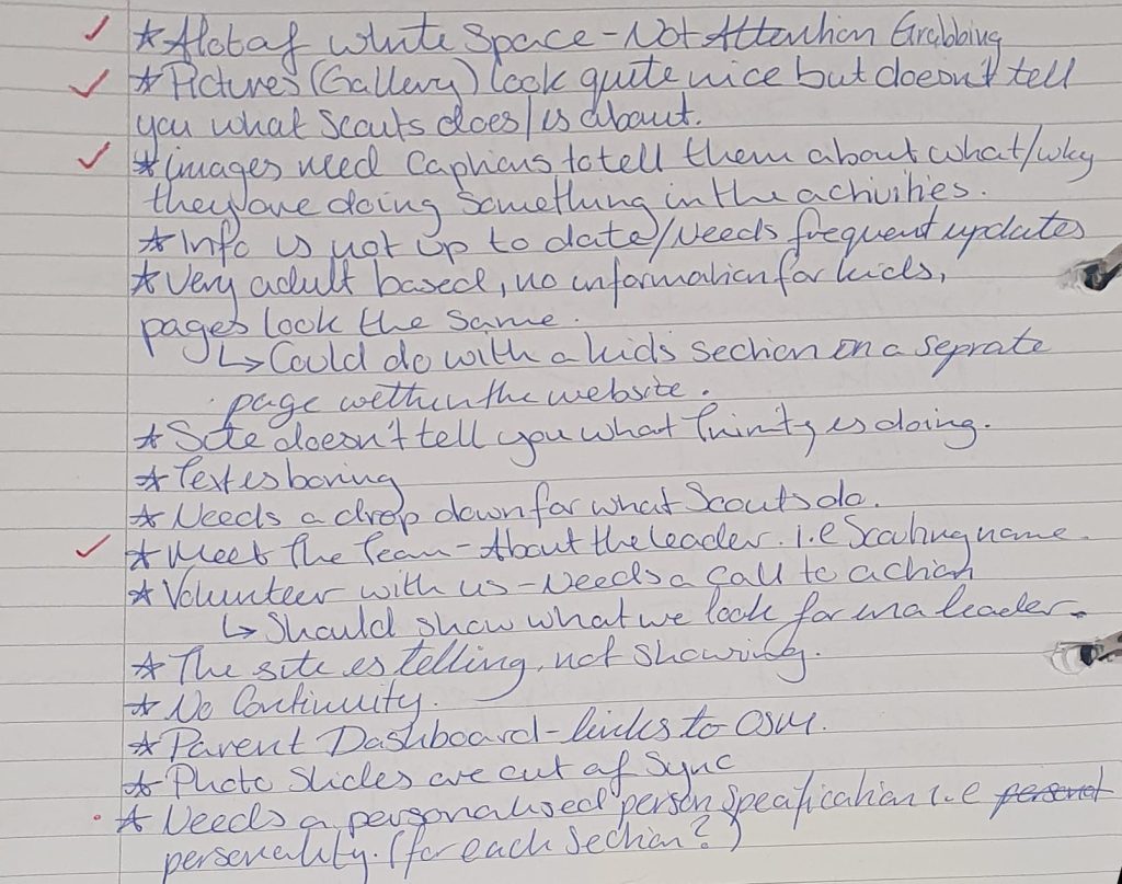
The key areas on the feedback that will be focused on when updating the site is:
- The site is not attention grabbing, it has a lot of white space.
- Images need captions to tell you what / why they are doing the activities
- Volunteer section needs a call to action
- It’s very adult based, no information for the kids
- No continuity
These are key bullet points that will be primarily considered as they are areas that have been mentioned repeatedly when asking various people on their feedback of the site.
Challenges
Scouts have branding guidelines in a .PDF that is accessible online. This .PDF covers their logotype, colours, typography, photography, speech style, how to make the brand inclusive and diverse and accessible, as well as how to use the scouting brand effectively.
Our visual identity is bold, clean and contemporary. It has greatest impact when we use it confidently and with simplicity.Scouts brand guidelines.
(Scouts brand guidelines. July 2024).
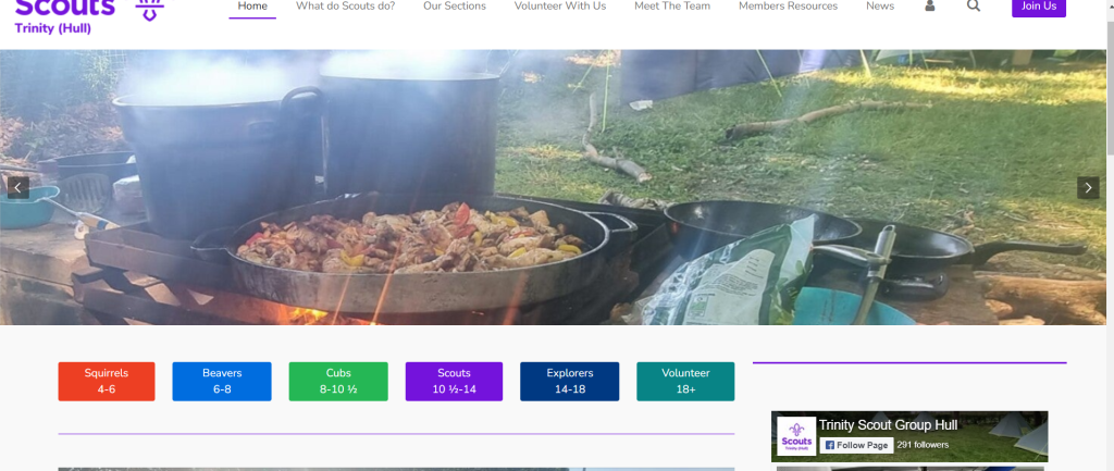
The current Trinity Scout website:
Taking what is mentioned in the guidelines and comparing it to the current site, it does not follow the brand ideals as it it is not bold or engaging to the viewer, when a parent / scouting leader was asked to give feedback on the site they said that ‘The site is telling not showing; it is not engaging -especially for kids- and the text is boring ‘. To ensure that the site is updated correctly and within the scouting brands, I will take into consideration posts/ content created by scouts to get a good understanding of how Scouts should be presented.
Typography, Photography and Colours:
The font that Scouts use is Nunito Sans and use 5 different weights: black, extra bold, bold, regular and light. This font was chosen as it is ‘ clean, contemporary and highly legible’ (Scouts brand guidelines. (July 2024)), because of these justifications mentioned in the brand guidelines and the typography is visually appealing, I decided that there is no reason to change the typography and will continue to use it when developing the content for Scouts.
There are various colours used in Scouts as each section has their own colours and there are documents correlating to a specific colour. Because of this, I have to consider which colours are used as people who are familiar with the colour meanings may be confused if I use the wrong colours i.e
- Scouts yellow (#ffe627) with black text is used for important documents such as safeguarding information and should avoid being used if possible – but can be used for high accessibility needs such as name badges as it has clear contrast.
- Using a sections colour for another section should be avoided i.e Scouts blue (#006ddf) is used for beavers and should not be used for other sections such as cubs whose colour is scouts green(#23a950).
The photos that will be used for Trinity scouts site are being taken from their official branding site (https://scoutsbrand.org.uk/), this is to ensure that the images are professional and vibrant enough to fit within their guidelines. The images used on the current Trinity scout site – whilst they are realistic representations on what the group does- does not look professional in terms of quality ( i.e blur lines, over exposure etc ) which makes the site less professional. However, to ensure that the correct presentation of the group is shown to viewers, the photo’s that are currently used on the site can be used in the gallery sections.
Wireframes +Design Iterations
Logo
Whilst re-designing the ‘Scouts’ logo I have ensured that it followed the branding guidelines by using either black, white or purple for the logo’s colouring.
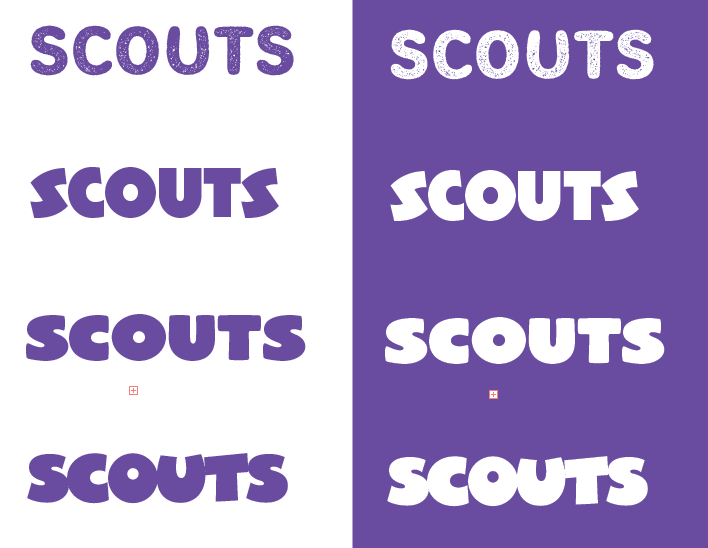
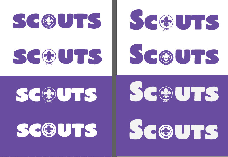
To re-design the logo to make it more engaging for all ages, I first began looking for typography that fit the scouting image. The first font was chosen as it looks like dirt which would best represent how active and how often scouts are outdoors.
The second font was chosen as it looked similar to the ‘Cubs’ logo which would be a good font to pick as it does not have a cartoon art style which means it will appeal to older age groups but is also intriguing with it’s unique shape for younger ages.
The third design keeps the simplicity of the current logo but makes it interesting to look at visually as it has bolder lines which gives it more of a dynamic shape.
The last design is more targeted towards the younger age groups as it has a cartoon art style which may be too childish for ages 8 1/2+.
The style that fit Scouts the best is the third design as it is easy to read, visually appealing and resembles the scouting brand well.
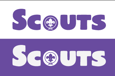
After looking at the guidelines for the logo, it was also mentioned that the fleur-de-lis should be visible when using the scout logo. To make it easy for the logo to be put anywhere without having to create different variations, I replaced the ‘O’ with the fleur-de-lis and tried different placements and colour variations to see which one would be best.
After getting feedback from people both in and not in Scouts, it was decided that the logo needed a capital S to make it stand out and have the fleur-de-lis the same colour as the text to make it look more like an ‘o’.The logo has been designed within the brands guidelines so if the purple logo cannot be seen clearly on a busy background then the white variation can be used.
Graphics for the site
A way to make the site more interesting for younger ages is by adding more graphics to the site, as there are different ages within scouts, the graphics that will be made will vary on each section. i.e squirrels ages 4-6 years, beavers 6- 8 ½ years.
Concept Designs


Final Designs
 Squirrels Final Design


Squirrels:
For squirrels, they currently have a squirrel design however it isn’t personalised to the group or engaging for kids as it is very simple, to adjust the design, I created 2 variations in the concept designs and asked for people to decided which one would be the better graphic to use for the section considering the age of the scouts etc. The overall feedback was that the middle design was the best one to use as it has the groups scouting colours and can have more pose variations as it is facing the screen instead of facing the side.
Beavers:
For beavers, there is already an illustration of a beaver for the section, however to make it more engaging for the beaver scouts, I created a kid version to use on the site as well. The design originally had the beaver waving but I created other pose variations to ensure the illustration could be used for various purposes.
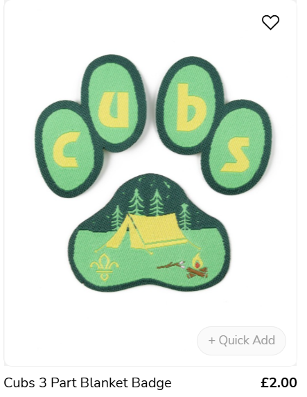
Cubs:
There are no mascots that appear for the cubs section but when looking at products designed for cubs, a paw symbol is used. Because of this, I created 2 options to be used for graphics on the site. The first concept was a wolf cub that wears the Trinity necker and the second concept is taking the paw symbol used in the online shop and make it more symmetrical. After getting feedback on which design would be the most effective, it was decided that the paw print is more suitable as it marks the beginning of transitioning from mascots to logos.
Scouts, Explorers and Volunteers
As these sections are older than squirrels, beavers and cubs, they do not have mascots however, to keep the section pages consistent there will still be illustrations primarily consisting of the fleur-de-lis.
- The ‘Network’ section is a group within Volunteers and is not a group that is run weekly, but instead has a few events throughout the year for people in network.
Wireframes
The low fidelity designs utillise various various elements / features inspired by the existing Trinity Scout site. When designing the wireframes, I focused on the key pages a parent/ volunteer would need information on. The current site the homepage had a live social media feed, I thought that this feature would be useful so I added it to the wireframe as it is a feature that would show viewers a brief understanding on the activities and events that go on. On the ‘Meet the Team’ and ‘Section Selection’ page, the layouts have been kept similar to the current site design as it allows for the best intuitive navigation for users despite the limited information on those pages. For the ‘Section About’ page, I kept the layout similar to the homepage to create more consistency within the site (as the site not being consistent was mentioned in feedback) and to make the navigation memorable.
The mid fidelity wireframes for all the pages enhance the low fidelity designs by adding more detail and structure. These wireframes extend down to the footer, which allows for a better visualization of the page layout. By refining the initial designs, the mid fidelity wireframes provide a clearer understanding of how each page will look and it ensures that all elements are well-organized and visually appealing.
For the high fidelity designs, the colours used are taken from the branding guidelines to ensure the scouting image is still kept in the site and the images are used to get a better understanding on how big the images should be to make it clear for viewers – repeated images used are temporary place holders for the images that will be used in the final design.
Compared to the first 2 wireframes, the final design uses the majority of the designs with a few changes on some i.e the meet the team and the section selection pages have breaks within the page by using group section colours.
Homepage Wireframes
 Low fidelity wireframe of the homepage


Meet The Team Page Wireframes
 Low fidelity wireframe formeet the team page


Section Selection Page Wireframes
 Low fidelity wireframe forsection selection page.


Section About Page Wireframes
 Low fidelity wireframe forthe sections info layout.


")
References:
Scouts brand guidelines. (July 2024). Available at: https://prod-umbraco-core.azurewebsites.net/media/psohiwqm/scouts_brand_guidelines_july2024.pdf [Accessed 8th Nov. 2024].
Trinity Scouts (2024). Trinity Scout Group. [online] Available at: https://www.trinityscouts.org.uk/ [Accessed 7 Dec. 2024].
Scouts (2018). Scouts – Protected Scout logos, names, badges and awards. [online] Available at: https://www.scouts.org.uk/por/14-other-matters/143-protected-scout-logos-names-badges-and-awards/ [Accessed 7 Dec. 2024].
Scout store (2024). Available at: https://shop.scouts.org.uk/search/cubs?pg=7 [Accessed 8 Dec. 2024].
Images + Information used on wireframes/ prototypes:
Trinity Scouts (2024). Trinity Scout Group. [online] Available at: https://www.trinityscouts.org.uk/ [Accessed 7 Dec. 2024].
Scoutsbrand.org.uk. (2019). Scout brand centre. [online] Available at: https://scoutsbrand.org.uk/. [Accessed 7 Dec. 2024]