Five inter-linked design exercises
Early design prototyping
EcoFuture:
For the first mood board I created for EcoFuture, I focused on collecting images and colors that were directly associated with green energy and sustainability. The purpose of this mood board was to visually capture what an eco-friendly business would be like and took inspiration from natural elements like plants, clean energy sources, and renewable technologies. This mood board was designed to prioritize the key features needed for the company which is nature, sustainability, and the future of clean energy.
After creating all 3 mood boards, I decided to focus on developing EcoFuture futher. I created a more detailed mood board to get a deeper understanding of the brand, I focused on design elements such as fonts and graphic styles that could help shape the brand’s identity. The colors were chosen to feel fresh and innovative, with a mixture of vibrant greens. This allowed me to start thinking about how these elements could be incorporated into the logo and other assets. The more detailed mood board allowed me to generate various new design ideas.
Cab-E:
For the Cab-E mood boards, I took inspiration from New York-style taxis. This moodboard presents the energy and vibrancy of the taxi service and focuses on elements such as the classic yellow and black color scheme, as well as bold, clear typography. I also incorporated images of city streets, taxis in motion, and urban landscapes to help keep in mind not only the business, but the places they go to. The goal was to create a mood board that emphasized speed and reliability.
InfluentHull:
For the InfluentHull mood board, I focused on a color palette of blue and white, as these colors are often associated with businesses. The colour blue gives the idea of confidence, whilst white represents simplicity, when theses colours are put together, they create a clean, modern aesthetic that would appeal to a wide audience, especially those seeking professional services. The mood board featured images of office buildings, clean lines, and minimalist design elements to present the brand’s focus on professionalism and effective solutions.
Logo
Before creating the logo for my new business, I decided to change the name from Eco Future to Bee Energy. This name change stemmed from the idea that bees are vital to our ecosystems and play an essential role in pollination. Bees are often associated with nature, environmental protection, and sustainability. Bee Energy is a more unique and memorable name which would help it stand out against it’s competitors.
After changing the name, I turned my attention to creating the logo. For the logo design, I chose to use Adobe Illustrator as it allows you to create vector-based graphics that can be resized without losing quality, this is important for ensuring the logo maintains its sharpness and clarity across different mediums and applications.
After looking at various fonts and asking for feedback, the outcome was that Blippo MN Black would be best choice as it has a bold, modern look, which complements the energy and power associated with electricity. The rounded edges of the font also give it a friendly, approachable feel, making the brand feel welcoming to a wide audience.
Given that the company’s name itself incorporates a bee, it was an easy decision to make the bee the central subject of the logo. Bee’s not only symbolize nature but also symbolizes the hard work. As Bee Energy is an energy-focused business, the icon needed to show this. I decided to incorporate an element of electricity, so viewers would immediately understand that the company deals with energy production or eco-friendly electricity solutions. The initial design of the bee had a thinner line around it however, as the font chosen was bolder and had a thicker line, i decided to make the bees outline to make the icon and text more cohesive.
After the icon and text was made I tested various placements and colour combinations to make the logo, as I had created many variations I decided to get feedback on which logo should be used.
 Typography and icons initial Design
 Pencil Wireframes


Wireframe prototyping
For Bee Energy, I chose to use Figma to design the website, as it offers a lot of flexibility and would allow me to easily adapt the design into a mobile app in the future if the company decides to grow. The website is a key part of the business, as it will be the first point of contact for many customers.
To make sure I designed a website that would appeal to the right audience, I looked at how a similar company, Octopus Energy, designed their website. They used simple, solid block colors and round edges in their site, which made it feel friendly, professional and modern.
The first step was creating a pencil sketch of the website layout. I used this sketch to work out what key information that users would need to know when they visited the site. I included sections like About Us, recommended products, tariffs etc.
For the mid-fidelity design, I started replicating the pencil sketch into a more structured layout. I put the key information into boxes to represent sections of the website as these would help me visualize where different parts of the page would go. As I reviewed this layout, I realized it was a bit too compact, and the sections didn’t flow as smoothly as I wanted them to, As the layout felt a bit too compact, I decided to refine it by creating a new wireframe that was more fluid and spacious.
For the high-fidelity design, I added more detail to make the website to get a better idea of the finished product. I refined the previous wireframe I created and adjusted the layout , making sure it looked more professional. I also added color to help me see how the website might look when fully developed. I chose colors that aligned with the Bee Energy brand which is yellow and green-blue. The higher quality design was much more visually appealing and helped me understand how the layout, colors, and text would come together in the final version.
Banners
For the banners, I decided to use illustrator as i would be able to resize any assets without lowering the quality of the image/ text.
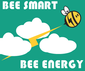
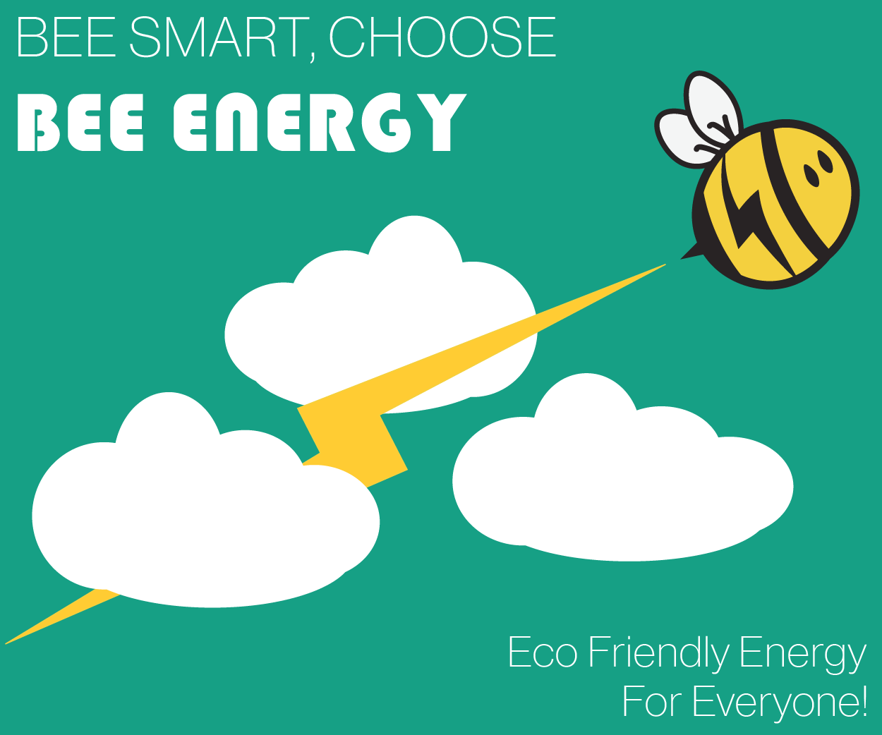
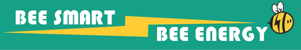
For the designs, I wanted all of the products to look cohesive so I decided to replicate the design of a bee flying through the clouds on all the banners.
The reason I chose this design is because bees are associated with being hard working and having this association presents the idea to a viewer that the Bee Energy staff will work hard for the customers. Similarly, the electric bolt coming through the clouds helps present the idea that the bee is moving extremely fast which also connotes the idea of the company having fast energy.
The original design of the square banner had just the bee with the phrase ‘Bee smart, Bee Energy’ and after reviewing this design, I realised that it needs more information on there to engage the viewer. To fix this, I added in the bottom right corner ‘Eco Energy For Everyone’, having this in the design makes it clear to everyone what the company is about.
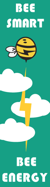
For the mobile and sky scraper banners, I decided to keep them simple as I was concerned that if I put too much on the banners, no one would be able to read it properly as the information would be cramped together.
Because of this, I did the original plan of having just a bee flying through the clouds as the goal for these banners is to make it easy for viewers to remember the name of the company. After creating the banners, I decided to turn them into moving graphics as a way to check that the sizing’s are cohesive and the layout works well.


Online video advertising
To create the online videos, I decided to use adobe after-effects as it has more features than adobe express as I need to use features such as scaling and movement. Both videos are designed for Instagram reels/ Tiktok but could easily be adjusted to suit platforms such as YouTube.
The first ad was designed to get the targeted audience interested in the business. In the video i utilised the rule of 3 (i.e You need energy, You want Eco Energy, You need reliability ) and this rule is based on the idea that something will be more memorable and persuasive if it is said 3 times instead of once or twice but to make sure the viewer looks at the information, I used a bounce effect on the text whenever it would enter or exit the screen. As the animations moving in the background was not the Bee Energy brand colours, I decided that the text would be the green-blue colours so it still has a part of the companies branding on screen at all time.
The second ad was made to give the viewer a summary on how the company gets their energy. The opening slide was simple to make as all I needed was to make the text move across the screen however in the next slide, I had to slow down the speed of the animated video as it was moving too fast and I wasn’t able to fit all the information in. After adding the fade animation to the text, I then created a frame where it tells the viewer to find out more on their site before the scene then changes again to show the same ending as the first ad. The music used in both of the videos was chosen as it is upbeat, engaging and makes the viewer feel motivated. I decided that both ads should have the same ending and music because I wanted the products to have a clear and cohesive link.
References:
Moodboards:
Cosmos. (2025). Jessica (@jessharkins) / Cosmos. [online] Available at: https://www.cosmos.so/jessharkins [Accessed 7 Jan. 2025].
Wireframe:
Octopus Energy (2024). Octopus Energy – A new breed of energy supplier. [online] Octopus Energy. Available at: https://octopus.energy/. [Accessed 7 Jan. 2025]
Videos:
Adobe Stock. (2025). Stock photos, royalty-free images, graphics, vectors & videos | Adobe Stock. [online] Available at: https://stock.adobe.com/uk/?gclid=Cj0KCQiAvvO7BhC-ARIsAGFyToVDvpjNv3J0P8FmRtNKNCJUGTOgMgWPyg0wkGQosf25pivQFNEDT9gaAm-1EALw_wcB&ef_id=Cj0KCQiAvvO7BhC-ARIsAGFyToVDvpjNv3J0P8FmRtNKNCJUGTOgMgWPyg0wkGQosf25pivQFNEDT9gaAm-1EALw_wcB:G:s&s_kwcid=AL [Accessed 7 Jan. 2025].