Final Design
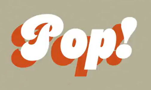
 Poster for Fizz Pop


Example of micro /macro
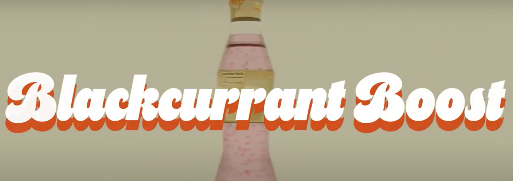
As initially planned, I used Edward Tufte’s principle of colour to ensure that there was a clear contrast between the typography and the background. This approach was specifically designed to make the text more legible and easily readable for viewers. By using contrasting colours, I ensured that the most important information stood out, drawing attention to key messages while keeping the overall design aesthetically pleasing.
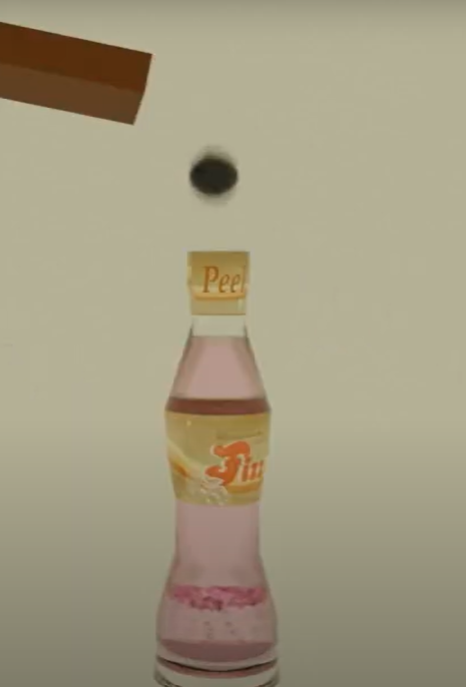
For the space over time principle, I decided to illustrate the movement of a blackcurrant bouncing down a slanted surface. The surface was deliberately tilted downward, which subconsciously suggests a sense of motion, the downward motion helped to reinforce the idea of movement and direction, making it clear to viewers that the blackcurrant was traveling downward. This visualization helped build anticipation to find out where the blackcurrant is going.
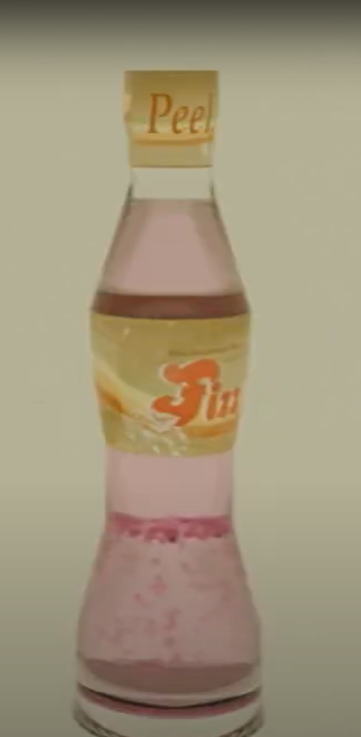
When applying the layering separation principle, I made sure to highlight the flavour of the product as a focal point of the design. The flavour was initially not directly mentioned, so it was important to subtly bring attention to it. This was achieved by ensuring that the product’s flavour was visually prominent and placed in a way that would be eye catching for the viewer. To maintain the viewers engagement, I incorporated a fast-paced movement of the bottle, shifting back and forth. This rapid motion kept the viewer’s attention fixed on the bottle, allowing them to appreciate the full design of the packaging.
Micro and macro was implemented in various ways throughout the animation. The animation alternates between wide shots that display the full bottle and close-ups that zoom in on specific sections of the design. The wide shots help viewers take in the overall design, while the close-ups allow them to focus on the smaller details—i.e textures, branding, and unique elements of the packaging. By using both wide and close-up views, I created an engaging experience for the viewer.
For the overall aesthetic, I chose to go with a classic vintage style, as it had been selected as the most popular choice from the survey that I sent out at the beginning of the research stage . This aesthetic aligns well with a nostalgic, timeless appeal, which creates a sense of familiarity. The use of the classic design elements helped communicate the quality and reliability of the product, making it stand out as both sophisticated and approachable. To complement this aesthetic, I selected the font ‘Cheesecake‘ by Simonson, M., as the main font. This typeface has a retro style that perfectly matches the vintage theme.
By integrating Tufte’s principles and aligning the design choices with the desired aesthetic, the animation not only highlights the product’s key features but also creates a visually engaging experience that captures the attention of the viewer.
References
RetroVector (n.a). Free Blackcurrant Images – Browse 86 Free Stock Photos, Vectors, and Video. [online] Adobe Stock. Available at: https://stock.adobe.com/uk/search/free?k=blackcurrant&search_type=usertyped&asset_id=717154391 [Accessed 12 Mar. 2025].
Simonson, M. (2020). Cheesecake | Adobe Fonts. [online] Adobe.com. Available at: https://fonts.adobe.com/fonts/cheesecake [Accessed 12 Mar. 2025].