Composition
The composition of a design is a key influence in creating a good product. It impacts the way a product is perceived by the viewer and helps emphasize the primary image without having other objects become a focal point.
Balancing a composition involves arranging both positive elements and negative space in such a way that no one area of the design overpowers other areas.
Steven Bradley1
Good Example
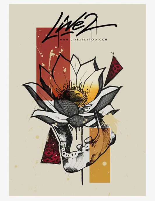
A good example of composition is the ‘sketchbook by live22‘. The cover utilizes static and dynamic shapes by having them point towards the primary image. The main object is placed in the center of the product to establish the primary focal point, the viewers eyes then move down towards the skulls mouth- as it is part of the focal point – and then the viewers eyes work their way back up to the top of the cover to see the title, this is influenced by the colour black and how it is used down one single line throughout the middle of the cover. Negative space is also used to frame the focal point as the space around the objects frame the image.
The vibrant colours and gradients of the shapes around the primary object are complimentary to each other. Red and orange tones are warm colours, this allows the viewers to creates conceptual ideas such as the objects that are red symbolize fire burning the orange/yellow shapes which may represent the flower and its petals.
The typography used for the cover is also effective in communicating the type of book it is. The font used has a drippy effect, creating the idea that it has just been painted on, this implies to the viewer that the book is about expressive art.
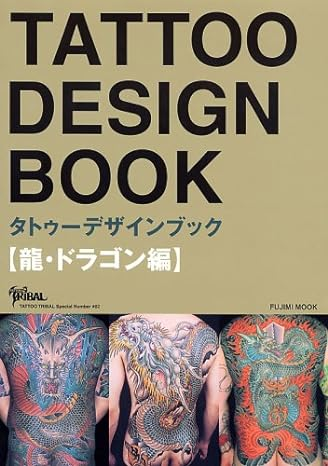
Bad Example
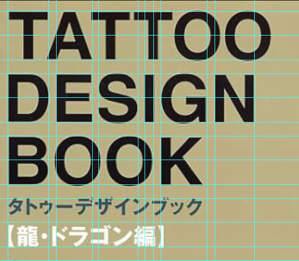
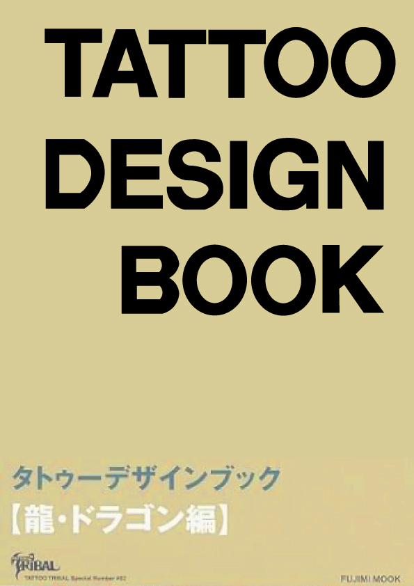
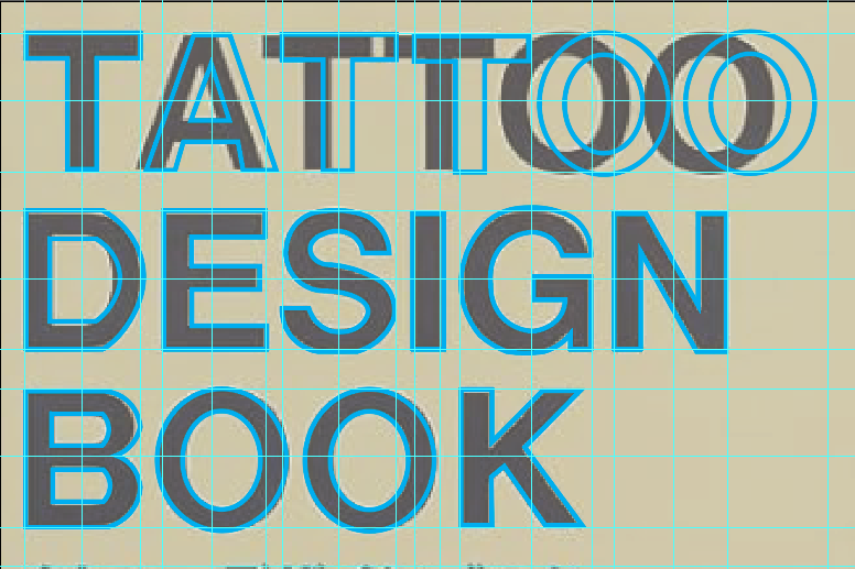
A bad example of composition is the ‘Tattoo Design Book3‘. The main reason that it is not a good example of composition is because even though the layout was a good concept, the execution of the design is not effective as some objects are slightly out of place. When guidelines were added to the book cover, it made anything that was out of place more visible- such as the word ‘Tattoo’.
The cover is not visually appealing, the reason for this is because there are too many items fighting to be the focal point- such as the images and each line of text.
All the colours from the images and text contribute to the lack of a clear focal point as the top half of the cover is more minimalist whilst the images on the lower section have many different colours.
To improve the composition of the book cover, I first adjusted the main title by modifying the kerning of each character, this allowed the layout look more visually appealing and then I removed the images as it took too much attention away from the title. The majority of the colours fit the theme of the book so I decided to keep the colours but adjust them slightly so there was a clear focal point.
- Steven Bradley,2017,Design Principles: Compositional, Symmetrical And Asymmetrical Balance, 10 Mar, Available online: https://www.smashingmagazine.com/2015/06/design-principles-compositional-balance-symmetry-asymmetry/#:~:text=Balancing%20a%20composition%20involves%20arranging,try%20to%20become%20the%20sum. [Accessed 4/11/2023] ↩︎
- Live2 – (n.d.)- Sketchbook – https://www.tattooebooks.com/tattoo-ebook/sketchbook-by-live2/ [Accessed 4/11/23] ↩︎
- Tattoo Densign Book, 2006 – https://www.amazon.co.uk/Tattoo-Design-Book-Gold-Bk/dp/4894216736 [Accessed 4/11/2023 ] ↩︎