Editorial Logo Design

The logo I am creating is for a publishing company that creates, designs and publishes their own creative art books. Because of the genre of books the company publishes, the colours, font and image used for the logo must reflect the companies creative ideals.
To begin creating the logo, I started listing concepts I wanted to portray within the design. Once I had created the list, I circled which words overlapped with each category, creating icons the words were associated with. The words ‘Identity’ and ‘Creativity’ were the words that were in both groups and stood out to me.
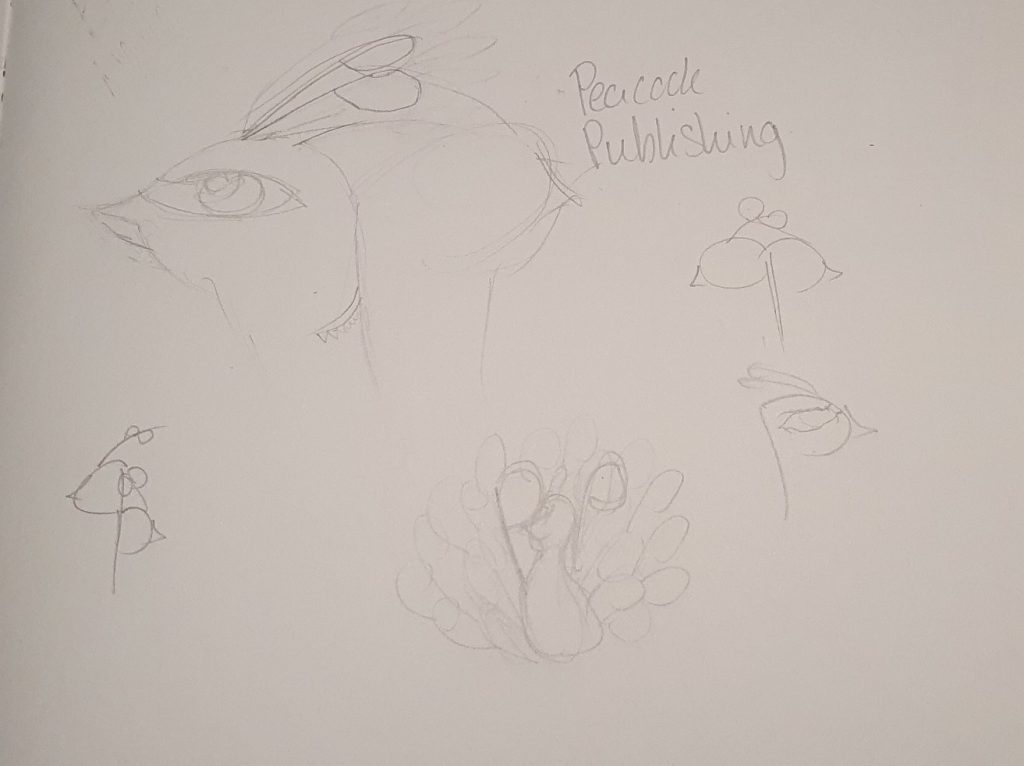
Because I wanted the logo to stand out, I looked at animals associated with creativity and based the logo design off of that animal, in this case peacocks were the animal that was associated with with stood out.
Peacocks are associated with creativity (Manley, 2023) but are also associated with new beginnings and self expression, as the peacock is associated with many things relating to artistry, it was the best animal to design the logo around.
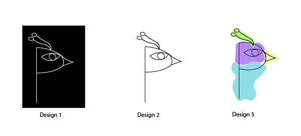
Developing from a peacock, I began sketching ideas to go with the company name, Peacock Publishing. As both words have the letter ‘P’ in them, I utilised this when creating concepts for the logo.
When transferring the concepts to illustrator I experimented with a variety of designs however the design that stood out the most was the ‘P’ with the face of the peacock so I developed that design more by adding colour.
To choose which colours to add to the logo, I looked at what colours are associated with creativity as well as what meaning people subconsciously associate it with.
The colours I decided to use were;
- Blue – representing trust (Maybray, 2022)
- Purple – representing imagination (Maybray, 2022)
- Green – representing growth (Maybray, 2022)
- Yellow – representing creativity (cdispaces.ca, 2021)
The colours all complement each other and are visually appealing when put together. The symbolism of each colour also represent the image the brand wants to reflect to the viewer.
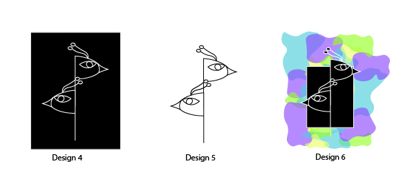
However, when the colour was added to the logo design, it did not have as big of an impact as I wanted so I decided to increase the detail in the logo so the colours could be used to make the design stand out more. To do this I developed more on the letter ‘P’ being in both words and replicated the original design so it looked like there was 2 peacocks however the logo looked unbalanced as there was too much facing in one direction, to fix this I flipped the lower peacock to make it face the other direction so the logo became more visually appealing.
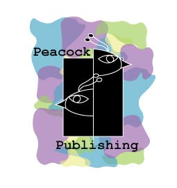
Final Logo
Manley, B. (2023). What Animal Represents Creativity? [online] Creative Primer. Available at: https://creativeprimer.com/what-animal-represents-creativity/#:~:text=The%20peacock%20is%20often%20associated [Accessed 7 Jan. 2024].
Maybray, B. (2022). Color Psychology: How To Use it in Marketing and Branding. [online] blog.hubspot.com. Available at: https://blog.hubspot.com/the-hustle/psychology-of-color. [Accessed 7 Jan 2024].
cdispaces.ca. (2021). The Best Office Colors to Boost Creativity, Happiness, and Productivity – CDI Spaces. [online] Available at: https://cdispaces.ca/insights/best-office-colors#:~:text=Yellow%20is%20the%20emotional%20color [Accessed 7 Jan. 2024].