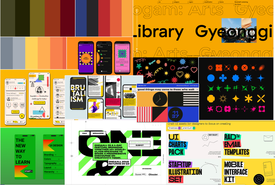
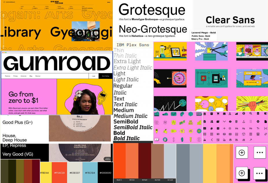
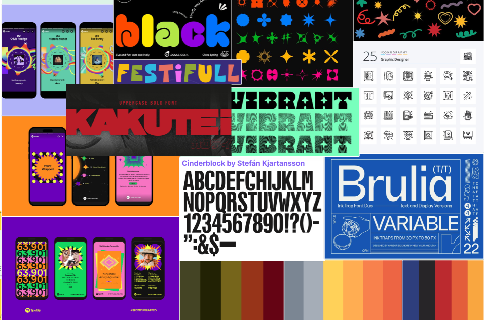
Mood Board (Post 4)
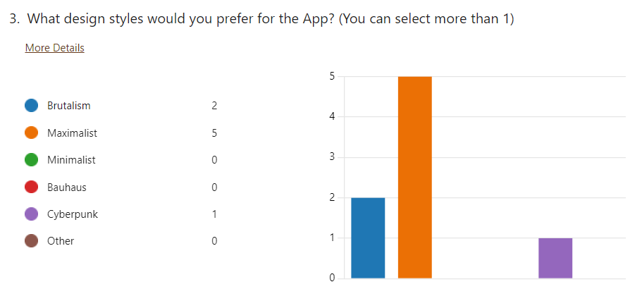
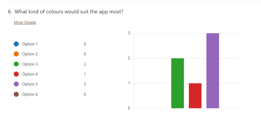
A survey was sent out to the targeted audience to find out what design style they preferred for the app and website.
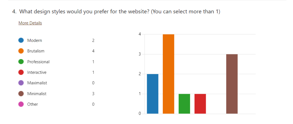
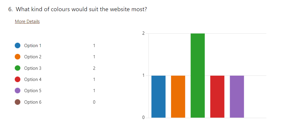
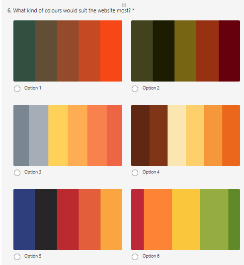
For the website, the targeted audience preferred a brutalism art style, a reasoning for this is that it is ‘more thematic for fire festival’, the audience also chose the third colour option, the justification for this is that it ‘ the colours work coherently but would also look strong and clean on their own’.
The results for the app showed a slightly different design style preference as majority voted for a maximalist design with a reason being that it would ‘fit the purpose and atmosphere of the fire festival more’. The colours chosen for the app was option 5 as the colours are ‘similar to fire and the night sky, as well as them creating a versatile pallet’.
As the styles are similar to each other and the survey responses also chose brutalism for the apps secondary style option, the designs are compatible with each other and make the products more unified.
To create a house style that incorporated both the apps survey results and the websites results, a third mood board was created. Creating a third mood board allowed for all design aspects to be included, as well as creating a unique design for the product.
For each mood board there are colours, font and icons as well as other websites/ apps that have used a similar design style.
Looking at the art style brutalism, there is a sub-category known as neo-brutalism. The difference between them is that brutalism started as an architecural movement whilst neo-brutalism is more of a design trend that has recently appeared (Harikumaran SM, n.d.) , because of this, the key designs will be influenced by neo-brutalism.
For a neo- brutalism art style, the website/ app will have vibrant, bold colours with no gradient and black strokes and black shadows. The website/ app would also have simple shapes and dynamic header fonts.
For maximalism, the website/ app would have a variety of bold, vibrant colours and gradients, the typography for the site would utillise different font sizes to focus the users attention to a key focal point. The pages would use a variety of graphics and interactivity to make the experience memorable.
Harikumaran SM, (n.d.). Onething – Leading Global UI UX Design Agency. [online] Available at: https://www.onething.design/blogs/neo-brutalism-ui-design-trend/ [Accessed 6 Apr. 2024].


You May Also Like
Website Design Development (Post 1)
Typography (Post 5)