App Design Development (Post 2)
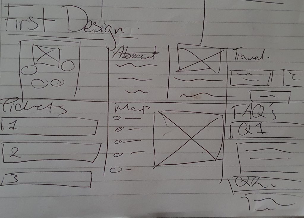
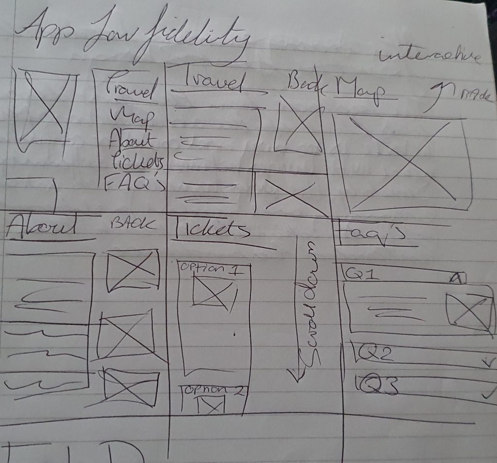

The first design layout for the app was made to resemble the websites first design, however, after gaining feedback about the app from users, it was mentioned that the display would be too crowded in the first layout as the buttons would be squished together when replicating the design.
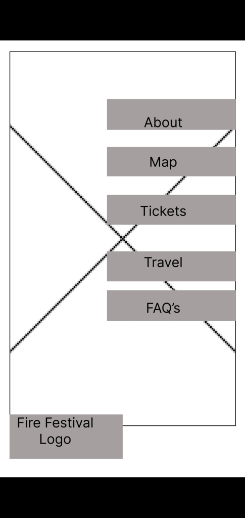
To improve this design, the text was unified into one line and then placed on the right side of the app. The fire festival logo was then moved to the bottom left corner so it looked cohesive with the website.
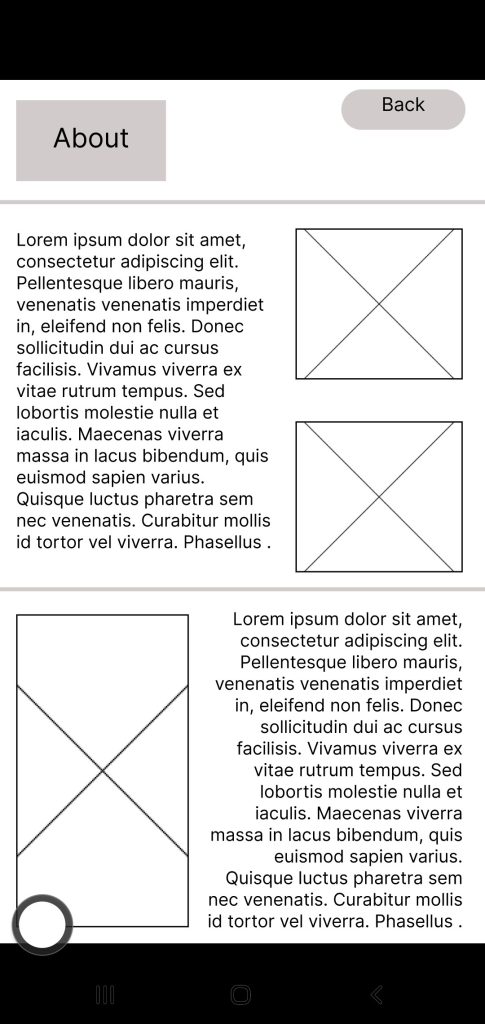
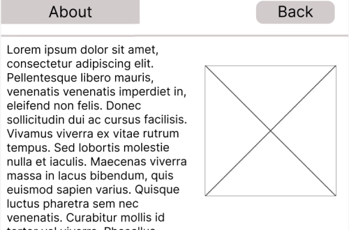
The ‘About’ page, whilst it had the same layout as the website, it was too cramped together, to resolve this issue, the image sizes were adjusted and the text was broken down into smaller paragraphs to make the display visually appealing for the user.
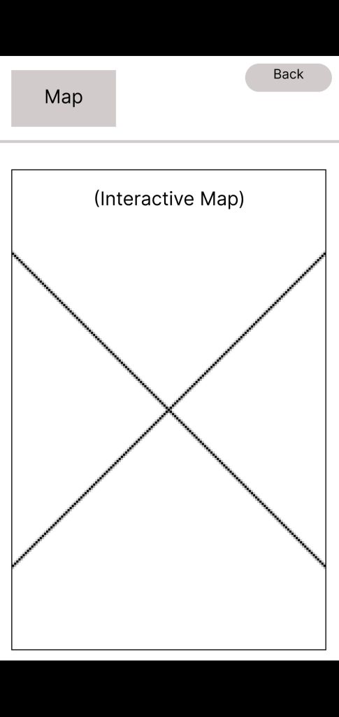
Compared to the website, the apps ‘map’ category will have an interactive map, this is so users can navigate the festival on site. There will also be physical copies of the maps available if users are worried about battery usage.
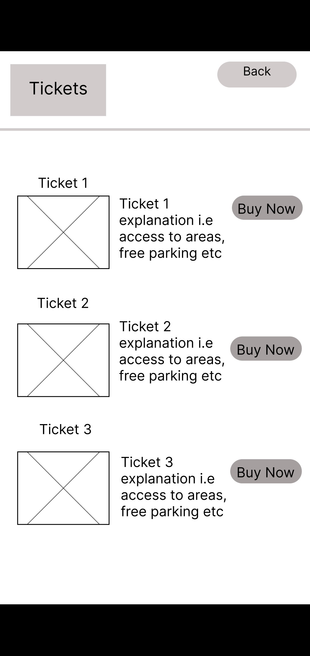
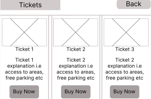
The layout design for the ticket section on the app originally had the same layout as the website, however, to utillise space and make the layout easier to understand for users who usually buy tickets in person, the three vertical columns were changed to horizontal rows as users would instinctively understand to scroll up/down instead of left to right.
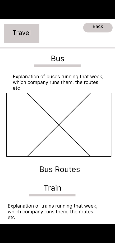
For the travel page, the first design had an image on the right side of the screen with text on the left. Whilst the layout of the page was easy for people to navigate and read, it was changed slightly so the text was above the image of the routes a bus / train/ taxi would take. This was done to improve the appearance of the site whilst keeping the information easy for users to read.
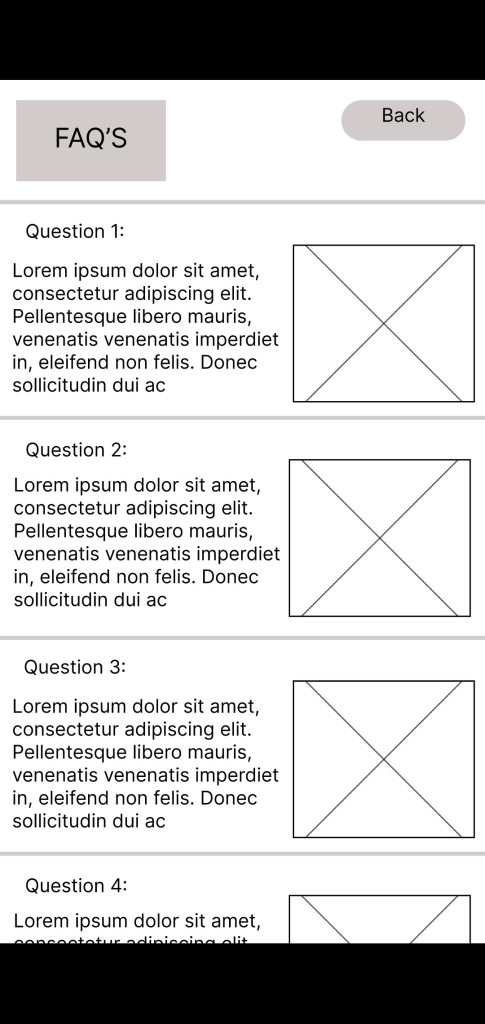
The layout of each page is designed to make it easy for all age groups to use -whilst the primary audience influences the majority of the product design, secondary / other audiences also need to be considered to ensure the best interactivity on the app.


You May Also Like
Responsive Designs + Call to Actions (Post 3)
Website Design Development (Post 1)